

UX Team Members
Bonnie: UX Researcher, UX UI Designer
Sean: UX Researcher
Kathryn: UX Researcher
Problem Space
It is sometimes difficult for patrons to efficiently find the information they are seeking on museum websites due to poor categorization and/or naming of pages. If patrons cannot find the relevant information (e.g., hours of operation, upcoming exhibits, extended hours, guest/group discounts, etc.), then they will not plan a visit to the museum or may have a less than ideal experience.
How might we redesign the Brooklyn Museum’s website navigation so that patrons can better discover the specific information they are seeking?
Hypothesis
Museum patrons need the Brooklyn Museum to have a usable website so that they may find the information they need in order to have an optimal experience whether online or in person.
Assumptions
Patrons need to know the museum’s hours of operations
Patrons want to know details for current and upcoming exhibits at the museum
They want to know whether museums have extended hours due to their busy schedules
They want to bring friends and family with them on their museum visit
Primary Persona

Our team uses a persona to guide us in our design decisions. A primary persona represents our target audience’s needs, pain points, and goals. Sometimes clients provide their own persona based on past research whereas other times our team will create a persona from scratch based on our own target audience research.
UX Process


Exploring & Understanding Users
We research in order to understand how we can help museum patrons have a great website experience, especially while interacting with the website navigation (i.e., “information architecture”).
Research Goals
Understand Brooklyn Museum’s business as well as their competitors using tools such as the Business Model Canvas, Competitive Matrix, Competitive Feature Analysis.
Use “Abby’s Method” heuristics to evaluate basic elements of the website that need to be upgraded.
Determine what categories or labels on the navigation are the most confusing to website users by testing out the current website (i.e., Tree Testing & Card Sorting — Closed & Open).
Business Model Canvas

After thoroughly reviewing Brooklyn Museum’s website, we found that they offered a variety of culture and art including exhibits, classes, tours, resources, and products. Brooklyn Museum has a variety of revenue streams and deliver their products/services through many channels. They have many different types of customers and resources/partners. They like to keep their website up to date because they know their customers rely on current museum information for their visits. It is clear that Brooklyn Museum’s business relies on getting relevant info to their users.
Competitive Matrix

The competitive matrix shows where Brooklyn Museum falls relative to its competitors when it comes to being a multifunctional venue and having exhibition variety along with a broad range of museum hours like extended hours one night a week. It appears the main aspect setting Brooklyn Museum apart from its competitors is its poor website, which isn’t very visually stimulating.
Competitive Feature Analysis

Our competitive feature analysis showed that Brooklyn Museum’s website had all the standard features of its competitors except for its lack of creative user interface design. Some of its competitors had animated images on their homepages that really drew in the user to explore the website. It is imperative that our design focuses on UI design to get the museum’s website up to standards.
Tree Testing (Current Website)
Tree testing is a type of navigational study that helps us understand the whole taxonomy of a website. Taxonomy is the logical sequence and what makes sense regarding navigational “labels.” We used optimalworkshop.com’s “Tree Jack” tool for our study. We use this method to determine how users are currently navigating through the website.
Scenarios & Tasks

About 11 participants were given 3 scenarios/tasks, which required them to interact with Brooklyn Museum’s current primary & secondary navigation. If a participant completed a task without viewing non-relevant pages, then it would be considered a direct success. Whereas, indirect success is a situation where participants temporarily veer off course, but ultimately successfully complete the task.
Results


Key Takeaways
For all 3 tasks, only 30% of participants had correct answers.
About 73% of participants had direct success on Task #1, which required them to navigate to the “Visit” page to see “Hours & Admission.”
Task #2 required participants to navigate to the “On View” page to discover the “Upcoming Exhibits” — only 18% had success.
No participants had success on Task #3 when asked to navigate to the “Education” page to gather more information under “Adults & Academics.”
The tree study showed that Brooklyn Museum’s navigation was in poor shape as testers only really managed to successfully complete 1 out of the 3 tasks.
Relabeling and/or recategorizing of items needs to occur to make the navigation more intuitive for users.
It’s apparent that current navigation item names don’t accurately reflect what its contents are, for instance, “On View” doesn’t convey “Exhibits” to the majority of people.
Card Sorting (Current Website)
Card sorting is a research tool used for evaluating a website’s information architecture. With this tool, participants are asked to categorize items given to them. Card sorting gives us insight into how users naturally organize these items and whether these items are appropriately named.
Details
Two rounds of card sorting were held with one round of open card sorting and one round of closed card sorting. In “open card sorting,” participants create their own categories for primary navigation while already labeled cards are provided to them for secondary navigation. Whereas in “closed card sorting,” participants are provided with both primary and secondary navigation choices to group together as they desire.
Open Card Sorting Results


For open card sorting, participants are free to group secondary navigation items as they wish and choose any name for that group. Below are a few of the groupings and names that the participants chose. These groupings and labels provide our team with insight on the best way to redesign the Brooklyn Museum’s information architecture.


Open Card Sorting Key Takeaways
These insightful results showed what items participants grouped together and what they would name the category.
For example, one popular grouping contained the following: Hours & Admissions, Directions, Access, Amenities, Floor Plans, Contact Us, Tours, Visitors with Disabilities. Category names for this grouping included “About”, “General Information,” “Visit,” and “Visit Us.”
Many of Brooklyn Museum’s existing category names & items are justified while some items need relocating.
In open card sorting, it’s helpful to see alternative names we could give certain categories, i.e., primary navigation menu items. Specifically, it is important to note that some of the category names (e.g., “On View”) should be updated (e.g., “Exhibit”) to take in consideration the labeling the participants thought would best suit these groupings.
A few secondary navigation items such as “First Saturdays” should be renamed to be more descriptive of what it really represents (i.e., free admission to the museum every month).
Closed Card Sorting Results

Closed Card Sorting Key Takeaways
About 60% of participants knew that current, touring, and upcoming exhibits could be found under “On View.”
100% of participants did not think that “First Saturdays” would be in the “Visit” page as a free admissions perk, but rather located in the “Calendar” page. When no one can logically guess what “First Saturdays” is then it needs to be renamed to increase findability for that type of content.
About 80% of participants thought that “Public Support” would be on the “Support” page, however, it is actually located on the “About” page because this item describes how Brooklyn Museum is a “not-for-profit corporation.”
About 60% knew that “Hours & Admissions” would be in the “Visit” page, however, the rest of participants thought this information would be in the “Calendar” or “About” pages. These results confirm that certain content like “Hours & Admissions” should be located under a few categories (i.e., both “Visit” and “About” pages).
Only 20% of participants were correct in knowing that “Visitors with Disabilities” would be on the “Education” page. This topic needs to be located in a more intuitive category.
The closed card sorting results confirmed many of the same insights we derived from the open card sort results.
Heuristic Evaluation (Current Website)
The “Abby Method” for heuristics was used to evaluate Brooklyn Museum’s website for known UX problems in order to immediately design these issues out without necessitating external feedback. Aspects such as Findable, Accessible, Clear, Communicative, Usable, Credibility, Controllable, Valuable, Learnable, and Delightful were evaluated. We kept our persona Florence in mind during these evaluations.

My team evaluated the homepage, visit, on view, and education pages. This is a bar chart showcasing the average ratings for each element we evaluated. The majority of elements are rated good to excellent. However, as you can see, Brooklyn Museum’s website lacks in “delightfulness” across the board as it is rated flawed- a medium problem. All the pages evaluated felt plain and lacked interesting UI design. We want to get customers excited for their museum experience so it is imperative our redesign focuses on the UI aspect.
Generating Features From Insights
Insights from our research dictate the features that could be useful to the target audience. Based on insights, my team and I have brainstormed the following features. Here are the specific insights that led to these particular features.
Insights
INSIGHT #1: No participants had success when asked to navigate to the “Education” page to gather more information under “Adults & Academics.” It appears that the “Adults & Academics”page is poorly labeled.
INSIGHT #2: Only 18% of participants had success navigating to the “On View” page to discover the “Upcoming Exhibits” because the primary category is poorly named.
INSIGHT #3: Open card sorting results showed participants grouped “Facility Rental,” “Film & Photo Shoots,” and “Special Events” together under the category “Special Events” while closed card sorting showed no participant knew the location of these secondary category items.
INSIGHT #4: The actual content of the “Public Support” page does indeed belong on the “About” page, but its category name doesn’t appropriately describe its contents so participants incorrectly categorized it under “Support.”
INSIGHT #5: Closed card sorting showed that 100% of participants did not think that “First Saturdays” would be in the “Visit” page as a free admissions perk, but rather located in the “Calendar” page. This tells us that the “First Saturdays” label does not accurately describe its contents.
INSIGHT #6: The “Visitors with Disabilities” page is currently listed as “Access” under the “Visit” primary navigation menu so when it’s selected, the user jumps to a page under “Education” called “Visitors with Disabilities.” Testing showed that 80% of users believed that the “Visitors with Disabilities” page was categorized under “Visit” so it would be a unhappy surprise for users when they suddenly find themselves in a different primary category than what they chose. It appears the “Visitors with Disabilities” page houses two distinct pieces of content: (1) Accessibility info for Visitors with Disabilities and (2) Educational Programs available for Visitors with Disabilities.
Features
FEATURE #1: The “Adults & Academic” content needs to be split into two different pages named “Fellowship Programs” and “Academic Tours” to better describe its content and increase findability.
FEATURE #2: The “On View” page needs to be appropriately renamed to “Exhibit” to better describe its content. User findability will be increased with this change.
FEATURE #3: A 10th primary navigation category called “Special Requests” should be created to house these orphan subcategories of “Facility Rental,” “Film & Photo Shoots,” and “Special Events.” This new category will better describe the content it houses and will increase user findability.
FEATURE #4: The “Public Support” page needs to be renamed “Mission Statement” to better communicate that the page describes “Who Brooklyn Museum Is” so that users can discover it in the “About” primary navigation category.
FEATURE #5: The “First Saturdays” page needs to be appropriately renamed to “No Fee Entrance” to better describe its content as something involving the actual visit. User findability will be increased with this change as users will know to discover it under the “Visit” page.
FEATURE #6: The “Visitors with Disabilities” page should be spilt into two separate pages named “Access” (i.e., Accessibility info for Visitors with Disabilities) to be housed under the “Visit” page and “Programs for Visitors with Disabilities” (i.e., Educational Programs available for Visitors with Disabilities) to be housed under the “Education” page to separate its distinct content. These new subcategories will better describe its content and will increase user findability.
Brainstorming Potential Designs
Design Studio Drawings
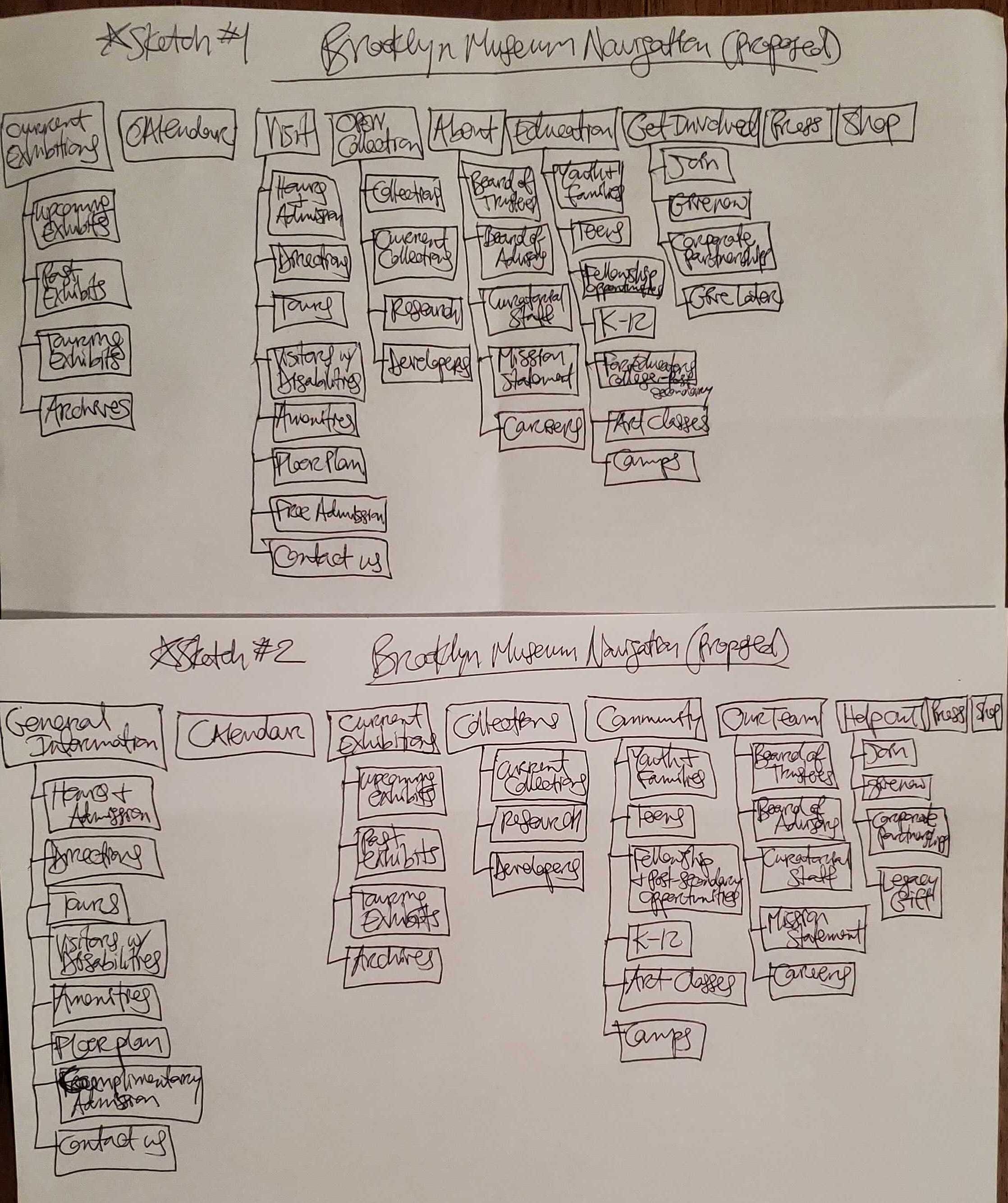
With specific features in mind as dictated by our research, our team participated in a design studio to quickly generate as many ideas as possible in a short amount of time. We went through two rounds of design studio where for each round, we each sketched silently for 5 minutes, presented our sketches to each other, critiqued each other’s designs for 1 minute, and then sketched again silently using the best ideas for the next sketch. We focused on designing the primary and secondary navigations in order to improve the website’s information architecture. In the end, together we drew a final design agreed upon by everyone — we created the best redesign version incorporating the new features.
In the end, we together created a museum webpage that elevated both primary and secondary navigations. We would aim to keep the same aesthetic and branding contained the original website in our updated user interface design, but with added “delight” and with more appropriate descriptions and labeling to increase user findability as well as communication.
Designing An Improved Website Navigation
Based on the ideas generated in design studio, our team redesigned Brooklyn Museum’s information architecture (i.e., primary & secondary navigations) as illustrated in site maps, annotations, user flows, high-fidelity screen concepts, and a high-fidelity prototype.
Current Information Architecture


It is important to note that two pages on the current site map contain links to other primary navigation categories, which creates a lack of user controllability. If a user is looking though the “Visit page,” the user will be frustrated that they are suddenly on the “Education” page when they were only browsing items under the “Visit”page. Based on our research findings of the current website, there were definitely issues with category/label names and/or groupings.
Proposed Information Architecture & Design

The proposed website navigation site map reflects the recommended improvements. As you can see, there are many annotations describing such changes. For instance, as you can see to the top right (i.e., Annotation #15), a 10th category on the primary navigation was created. “Special Requests” houses the secondary navigation items that didn’t quite have an intuitive place in the other categories. Users can now find “Special Event Hosting” “Facility Rental” and “Film & Photo Shoots” in “Special Requests” as all these items pertain to asking for permission to use the museum in some manner.
Annotations of Website Navigation Improvements


Above are images (click to enlarge) of Brooklyn Museum’s current website with annotations indicating and explaining why particular changes were made (Note: Asterisks show which primary navigation category page is being viewed).
Website Homepage Redesign

High-Fidelity Concept Screens


Usability Testing Results
Tree Testing (Proposed Website)
For the second round of tree testing — We tested the proposed website navigation to determine whether our changes based on round one testing were successful. We used the exact same 3 tasks from the first round except that two words were changed out for their synonyms (e.g., Exhibit => Art Installation; Tour => Seminar) to avoid a “word find” hint to users, which would skew our data.
Tree Testing Results


Tree Testing Key Takeaways
For all 3 tasks, 60% of participants had successful completion, which is 30% higher than in round 1 with the original navigation where users had 30% successful completion.
For Task #1, about 80% of testers successfully completed the task with 60% of those testers completing the task directly, which is 7% higher than round 1.
Task #2, 50% of testers had direct success in completing the task. This success rate is 32% higher than the 18% successful completion rate from round 1 testing with the original navigation.
For Task #3, 50% of testers successfully completed the task with 40% of those testers completing the task directly. This success rate is 50% higher than the 0% successful completion rate from round 1 testing with the original navigation.
Based on the success rate of all 3 tasks, especially compared to our round 1 results, it appears that our proposed navigation design is much more intuitive for users than the original/current navigation. It’s amazing that even the most successful category from round 1 improved by 7% and that the worse success rate from round 1 improved by 50%!
Card Sorting (Proposed Website)
For the second round of card testing, we solely conducted a round of closed card sorting — We tested the proposed website navigation to determine whether our changes based on round one testing (i.e., current website) were successful.
Card Sorting Results

Card Sorting Key Takeaways
The average time to complete the closed card sorting was decreased by 50% — rather than taking 14 minutes, it took participants about 7 minutes to sort this round.
About 50–88% of participants knew that “Touring Exhibitions,” “Past Exhibitions,” “Exhibition Archives,” and “Upcoming Exhibits” are grouped under the “Exhibitions” category page, which is a much higher percentage than when this category was named “On View” and only about 60% knew the content it contained.
The “Contact Us” content should also be available on the “About” page as 50% of participants mistakenly thought it could be located there.
For the “Special Requests” page, 50% of participants knew that “Facility Rental” and “Special Event Hosting” would be located under this new category. Overall, this new “Special Requests” category appears helpful to users.
After relabeling “Public Support” to “Mission Statement,” 50% of participants now knew it could be found on the “About” page whereas 0% knew it would be in this category in the first round.
Regarding the second round of closed card sorting — It appears that the categories and cards are more intuitive for participants since they grouped everything much faster by 50% and accurately predicted the content locations.
Next Design Iteration
Brainstorm new names for the primary navigation category of “Special Requests,” add “Contact Us” as a category under a few different primary navigation pages such as “About” and “Visit” or create a button for it on the website header, add a link or embed a list of upcoming and current exhibits on the “Calendar” page, discover a better way to phrase “Academic Tours” or relocate that subcategory to under “Visit” rather than “Education,” adjust the brightness of the website branding colors (i.e., pink & blue) to alleviate eye strain and promote accessibility.
Recommendations: Thoughts & Next Steps
Based on our second round of usability test results, it’s apparent that our proposed Brooklyn Museum website navigation is more helpful and efficient to users than the original navigation.
We recommend the continual iteration and testing of the navigation design. A few more label categories need to be reworded as well as the creation of additional paths to the more important content — our navigation redesign will address all of the issues we’ve discovered in our most recent round of testing. We look forward to the continued success of the Brooklyn Museum!
Reflection: Lessons Learned
Every team member has a unique set of skills so in order to get the best product design, make sure to help each other lean into strengths.
Intuitive information architecture is vital to the success of a company because if patrons cannot find what they need smoothly the first time visiting a website/app, there may not be a next time. Sometimes a company’s competitors may offer better alternatives and that would be a missed opportunity.