

UX Team Members
Bonnie: UX Researcher, UX UI Designer
Abby: UX Researcher, UX UI Designer
Yazhen: UX Researcher, UX UI Designer

Problem Space
Young people need an easy to access outlet for caring for their mental health. Young people feel anxious and stressed about transitional periods in their lives. They need a safe and supportive way to learn how to deal with these changes. How might we support young people in learning healthy and effective ways to cope with their emotions?
Hypothesis
There’s a rising suicide and depression rate among young people. They don’t know how to deal with the stressors and pressures of everyday life, and can feel guilty when taking a mental break.
Assumptions
Young people often feel helpless when they’re stressed because they don’t have enough life experience dealing with emotional challenges
There’s a general stigma around mental health, which makes it more difficult for young people to seek help
There is increased pressure to be successful by a certain age
People are too busy to make time for themselves to recharge

Business Partnership
Upon identifying the problem area, we decided that Teen Vogue was the prime candidate to partner with in order to reach millions of young people. Their site offers young people many ways to learn about themselves and supplies them with articles about their emotions and health. They aim to tell stories that normally go untold and help to provide resources to young people. According to Teen Vogue, they are the young person’s guide to saving the world. Their goal is to educate, enlighten, and empower their audience to create a more inclusive environment. By partnering with Teen Vogue, our app would gain a unique and focused user base—young people who are looking to better themselves and the world around them. Together, we would be able to reach and educate a wider audience.
UX Process


Exploring Self-Care Resources & Understanding Users
Interviews

The goal is to gain an understanding of how young people (i.e., Millennials/Gen-Z individuals, ages 18–25) currently maintain and strengthen their mental health. We interviewed 5 members of our target audience to learn more about their needs, goals, frustrations, and pain points. We asked them a series of questions around how they cope with stress, what they do as a form of self care, and how they vent their emotions to gain insight into how to better serve their needs. From this we learned that lots of people like to cope and vent their emotions to their friends, have a routine as part of self care, and have learned to cope with their feelings through trial and error over time.
Affinity Map
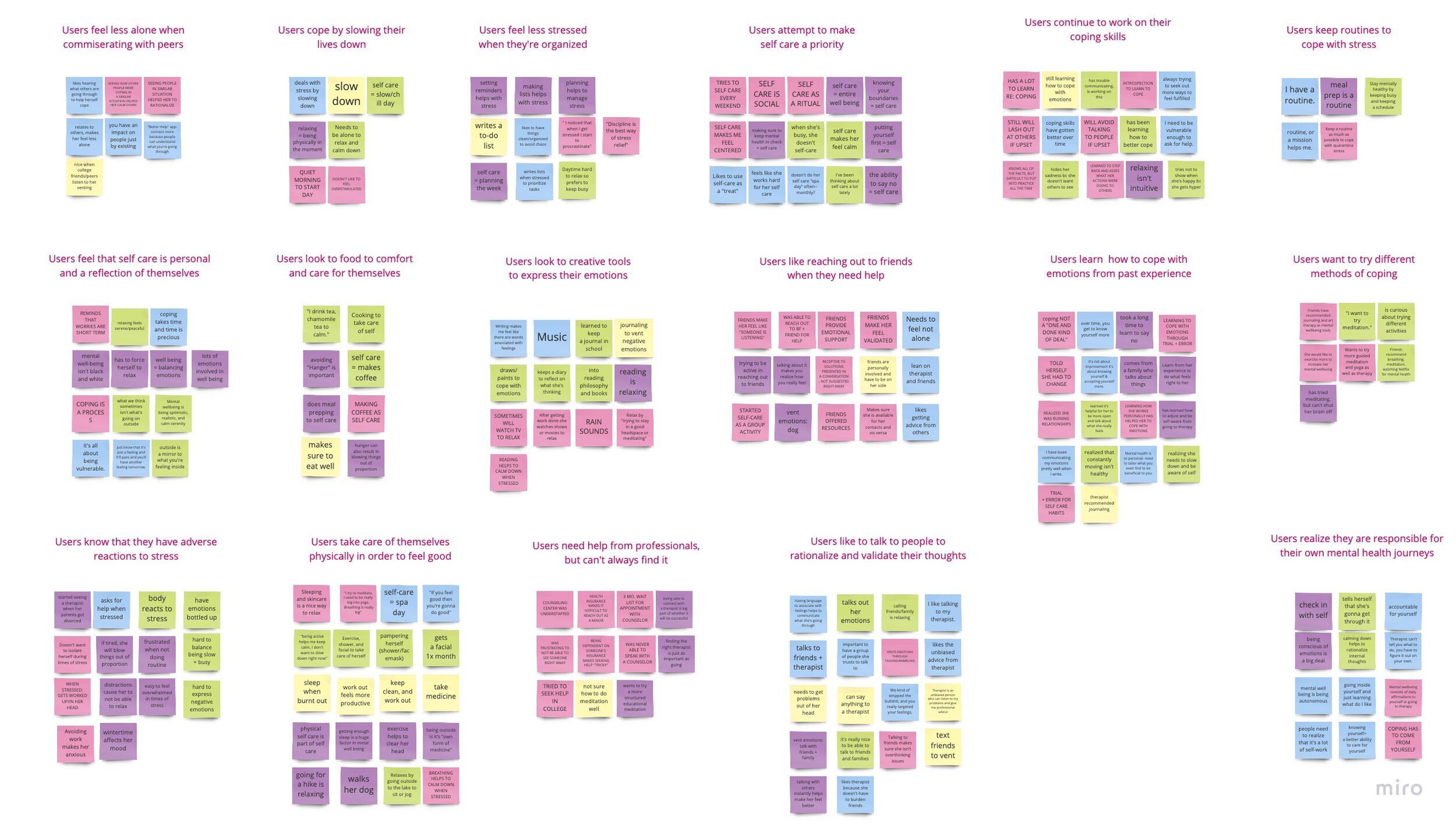
The affinity map helps us find patterns based on the thoughts and beliefs of all of our interviewees. We wrote down each of the facts/quotes gathered from our interviews on different post-it notes on a Miro board, silently grouped them where they best fit so that we could notice trends, and then turned each trend group into an insight. Some of our findings include the fact that interviewees showed some overlapping habits for coping, venting, and self-care techniques. We also learned that most interviewees utilized some form of commiseration with friends or family to help them vent emotions or frustrations. By creating insights, we could better generate features to help young people as well as create a persona to represent our target audience’s goals, needs, pain points, and frustrations to guide our product design.
Persona

A primary persona represents our target audience’s needs, pain points, and goals so we can better understand our target audience. The persona is a personification of all our research data so that we have someone specific in mind to design for. The insights generated from our affinity map clarifies our target audience’s goals, needs, pain points, and frustrations. We consolidated all these attributes into our persona. Our team needs to design for a person who is in the mist of a transitional period in their lives, anxious/inexperienced with dealing with stress, wants a safe space to vent emotions, needs helpful advice, and is open to learning new coping techniques. By creating a persona, our team can narrowly tailor and effectively design our product to help young people achieve their self-care goals. With a persona, all team members are aligned about who our target audience is.
User Journey Map (Original versus Revised)


We mapped out a scenario where our persona is anxious about moving off to college so she researches more about the typical experience via Instagram, but becomes overwhelmed so she looks to her friend for comfort. We identified that Bay’s emotions start going downhill after she shares her frustrations with her friend, but her concerns were not well received. The map describes all of her emotional highs and lows during this interaction and allows us to identify opportunities for us to solve her issues. In order to create a journey map, we first described the steps our persona would take before, during, and after realizing how stressful college life might be. These steps were later broken down in phases and system touch points (i.e., technology interactions) were noted. At each step, we evaluated whether our persona would have an emotional high or low and noted any available opportunities to help her with her day.
We determined that some of the ways Bay’s experience might be improved is by the following: creating a platform that promotes sharing or talking about your problems with people who can understand and empathize, providing assistance or information in coping with negative emotions in a healthy way.
The revised journey illustrates how much our persona’s emotional experience has changed and improved with the use of the Ditto app. Like the original user journey, we outlined the steps Bay would take to cope with her stress, but with the opportunity to interact with Ditto. By using Ditto, Bay’s user journey has drastically improved. Specifically, in the phase of her day where she interacts with the Ditto, Bay now has a very positive emotional experience, especially when she’s able to reach out and commiserate with peers who are going through the same thing, which makes her feel supported and less alone. Her emotional low point has now transformed into a high point. By mapping out the revised user journey, our team could better visualize how much Ditto actually assists target users in accomplishing their self-care goals. Users will no longer feel alone or helpless when overwhelmed by negative emotions, they can commiserate with users who share similar experiences (e.g., big group chat or private messaging), and are able to receive and send support using the high five feature.
Generating Features From Insights
Insights
They enjoying learning about and connecting with others who have gone through similar or stressful experiences
Having others rationalize and validate one’s feelings assists in coping with emotions
It’s difficult to obtain professional help
An easy to access outlet is needed in order to care for one’s mental health
They want to learn new opportunities for self-care and stress relief
Features
Forums, chat rooms, adding new friends, direct messaging
Mood tracking calendar with icons & information
Sending and receiving high fives
Availability of professional help or resources
Self-care tips and fun facts
Fun and welcoming user interface to provide an uplifting mood
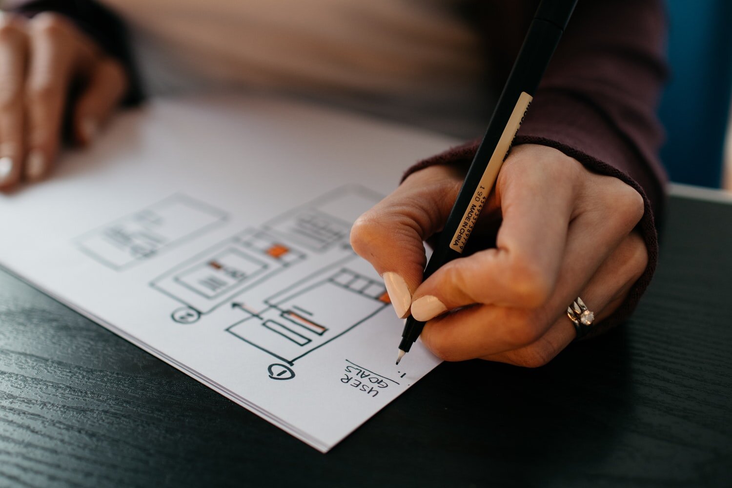
Brainstorming Potential Designs

Design Studio Drawings
With specific features in mind as dictated by our research, our team participated in a design studio to quickly generate as many ideas as possible in a short amount of time. We went through two rounds of design studio where for each round, we each sketched silently for 5 minutes, presented our sketches to each other, critiqued each other’s designs for 1 minute, and then sketched again silently using the best ideas for the next sketch. We designed the mood tracker, forums, and miscellaneous supportive features. Each round was finalized when together we drew a final design agreed upon by everyone — we created the best redesign version incorporating the new features.
In the end, we together synthesized common design elements for our low-fidelity wireframes including: on-boarding, the “Know Yourself” quiz, splash page (mood lifter), mood tracker, forum, individual forum, individual chat room, additional resources, and personalized alerts.
Designing a Self-Care App for Young People


Based on the ideas generated in design studio, our team designed the above screen concepts, visualized as the three tasks presented in our mid-fidelity concept usability testing. The arrows show the “happy path” a user would take to complete the tasks directly (i.e., without any deviation).
Usability Testing Results
Round 1 (Mid-Fi Design):

For the first round of testing, the vast majority of users passed through the tasks with flying colors and rated them as easy. For Task 1, all but one user completed the task directly. For Tasks 2 & 3, 100% of users directly completed the tasks.
Key Takeaways
Mood tracking icons were intuitive for most users
Users were motivated to click “Did you know” to learn more fun facts
Users found it easy to go through the actions of explaining their feelings, adding them to the tracker, as well as learning coping techniques at the end
Users appreciated that they had more options for coping (e.g., joining a forum, asking for professional help, or messaging a buddy)
The user who completed the task indirectly, was confused by the prompt and had trouble choosing the correct emotion
A few users wanted color added to the app
Users had very little trouble finding the forums from the “Mood Tracker” screen
Once within the forum, users successfully navigated into the correct chat room and were able to easily start talking with other users
Users felt that the chats were all very welcoming and supportive
They liked the ability to chat with peers and commiserate because they thought that it would be a useful feature
Some users took the time to read all of the chats, leading to a difference in completion time.
All users enjoyed the high-five animation experience even when they were unfamiliar with its purpose
Next Design Iteration: Add a feature where the user can also add today’s emotion by clicking into the calendar, make the “how to cope” page more visually stimulating, add additional facts under “did you know” to the “Mood Tracker” page for an added layer of interest and delight, add animation to the large icon at the top of the screen to increase user engagement with the screen.
Round 2 (Hi-Fi Design):

We were able to validate our design changes/upgrades in a second round of testing. For Task 1, all but one user directly completed the task and the average time to complete the task decreased by 43 seconds. For Task 2, all users completed the task directly except for one user who completed it indirectly and decreased this task’s success rate from round one. For task 3, there were 3 direct and 2 indirect successes, which decreased our success rate by 20% from round one. Also, those two users rated this task harder than users in round one, which decreased this task’s average easiness rating as compared to round one.
Overall what we experienced in high fidelity was a decreased success rate on two of the tasks. As we looked through the details we’ve concluded it is more likely due to the fact of it being a high fidelity polished prototype where users were motivated to explore more of the features rather than focus on task completion. We would like to further explore this assumption in another round of testing.
Key Takeaways
While some users were still a little confused with verbiage of the scenario (ie: overwhelmed = stressed), they all were able to complete the task
One user tried to tap on the calendar instead of on the emotions at the top of the screen
The majority of users went through the forum task quickly, as they are familiar with the chat room concept
Users felt like the chat forum would be a helpful feature
The user who completed the high-five task indirectly admitted to not checking notifications without having her phone vibrate or ding, so snack and tab bar notifications regarding high-fives went without notice
When asked to explore other forums, one user clicked on the ellipses instead of going back to the college forum page
Most users completed the high-five task quickly and thought it was intuitive
Next Design Iteration: Descriptions of the different emotions so users know what they’re feeling, an alternative way to enter a day’s emotion through the calendar, an analysis of the emotions collected to allow the user to see patterns and predict triggers, increase size or bold the text for the exit function on the “How to Cope” page, add major-specific college forums, create the ability to create a “screen name,” make the high-five animation more exaggerated to add excitement when returning a high-five.
Product Concepts & Prototypes Iterated


Recommendations: Thoughts & Next Steps
The Ditto app would greatly benefit from existing API’s (e.g., Google for login & authenticity — Google maps for finding therapist — Co-star for horoscope facts — National Suicide Prevention Lifeline for chat or calls when professional help is required) in order to make a more diverse and usable experience for the user.
The most important post-launch metrics are: in app experience and satisfaction levels, user engagement and time spent within the app pages, app download and referral rate, and retention of existing users. These metrics will measure the quality of the user experience so we can determine whether any features need upgrading.
Our team reviewed all our research, design, and testing results and boiled everything down to a high-level palatable list of next step suggestions: reiterate the Ditto design based on our last usability testing round 2 key takeaways/suggestions along with additional rounds of testing, track suggested KPI’s at relaunch, aim to launch Ditto during National Mental Health Month (occurring in May every year), and incorporate the necessary API’s. It’s also imperative to propose the Ditto app concept to Teen Vogue so that we can collaborate on a partnership together in order to help young people achieve their goals regarding self-care and mental health.
Reflection: Lessons Learned

There seems to be a real need for an extensive self-care app, especially for young people going through transitional periods in their lives. Although there are many resources available, these do not necessarily help young people achieve their self-care goals.
It’s important to validate product designs via usability tests as our mission is to design for the users and to not make assumptions about whether a feature/process is intuitive or helpful.
Working with an open minded design team can really elevate a product to perfection and make work enjoyable.