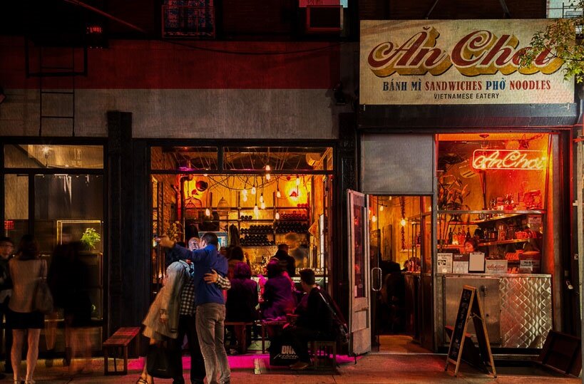
What is An Choi?
The restaurant owners aimed to bring authentic Vietnamese food to New York City and opened their restaurant in a small space designed to look like a street alley in Saigon. The restaurant’s atmosphere promotes diversity, community, friendship, and happiness. Friends and family can escape to Saigon at An Choi.
Team Members
Bonnie: UX Researcher, UX UI Designer
Jenni: UX Researcher, UX UI Designer
Kelsey: UX Researcher, UX UI Designer
Zhen: UX Researcher, UX UI Designer
Julie: UX Researcher, UX UI Designer
Mouzayan: Software Developer
Scott: Software Developer
Michael: Software Developer
Exploration & Features
The goal of research is to gain an understanding of what restaurant customers experience on a company’s website when attempting to locate relevant visit information. Some important research tools are interviews, competitive feature analysis, affinity mapping, crafting a persona, and creating user journeys. It’s also imperative to analyze the existing website for known basic UX design problems through Heuristic evaluation. User research creates insights that dictate the features our redesign will contain for its minimum viable product (“MVP”) in order to elevate the user experience of An Choi’s customers.
Persona

Our team uses a persona to guide us in our design decisions. A primary persona represents our target audience’s needs, pain points, and goals. Sometimes clients provide their own persona based on past research whereas other times our team will create a persona from scratch based on our own target audience research. Our proto-persona Serena assists us in our website redesign so that we’re all on the same page and have someone specific in mind to design for. She loves experiencing new foods and cultures — and would definitely would enjoy dining at An Choi!
Competitive Feature Analysis


Our competitive feature analysis showed that An Choi’s website needed to include some standard features contained in its competitors’ websites. In particular, An Choi’s website could benefit from the above designs/pages relating to “Hours of Operation,” “About the Chef,” simple yet effective primary navigation, bold call to action buttons, and an illustrated menu preview. All of An Choi’s competitors had high-quality imagery on their homepages and kept the aesthetic pretty simple as not to overwhelm customers. Websites were designed in a way that promoted users to explore the website and get them excited for their upcoming dining experiences. It’s imperative that our redesign focuses on the foregoing aspects in order to have An Choi’s website meet minimum standards.
User Stories

In order to better focus our website redesign, both the designers and developers set aside time to craft user stories together. These user stories were inputted into our team Trello board in order to stay organized about our team progress. To estimate the development workload, we played Developer Poker, a technique used to assign points to each story (i.e., simplest story at 1 point with the others based off it) with the designers deferring to the developers for final points.
Brainstorm
In order to brainstorm designs, with user stories in mind, we conducted a design studio where we individually generated many design ideas in a short amount of time, critiqued each others’ ideas, and then individually designed again with the best ideas discussed. Both the designers and developers participated in this process, which was really helpful in bonding us as team. We held one round of design studio and afterwards as a team created a final design everyone was happy with — desktop & mobile views for the responsive website.


Product Concepts & Prototypes
Based on the design elements agreed upon in design studio, our design team created a hi-fidelity concept of the An Choi website. We attempted to keep the best characteristics of the original design in our redesign in order to keep its “cool vibe.”
Current Design
The current design contains a collage background, delivery/pickup options, restaurant info, link to the menu, social links, and high quality images. However, the website is a bit overwhelming with elements on top of each other, which prevents customers from easily finding what they need before their visit.


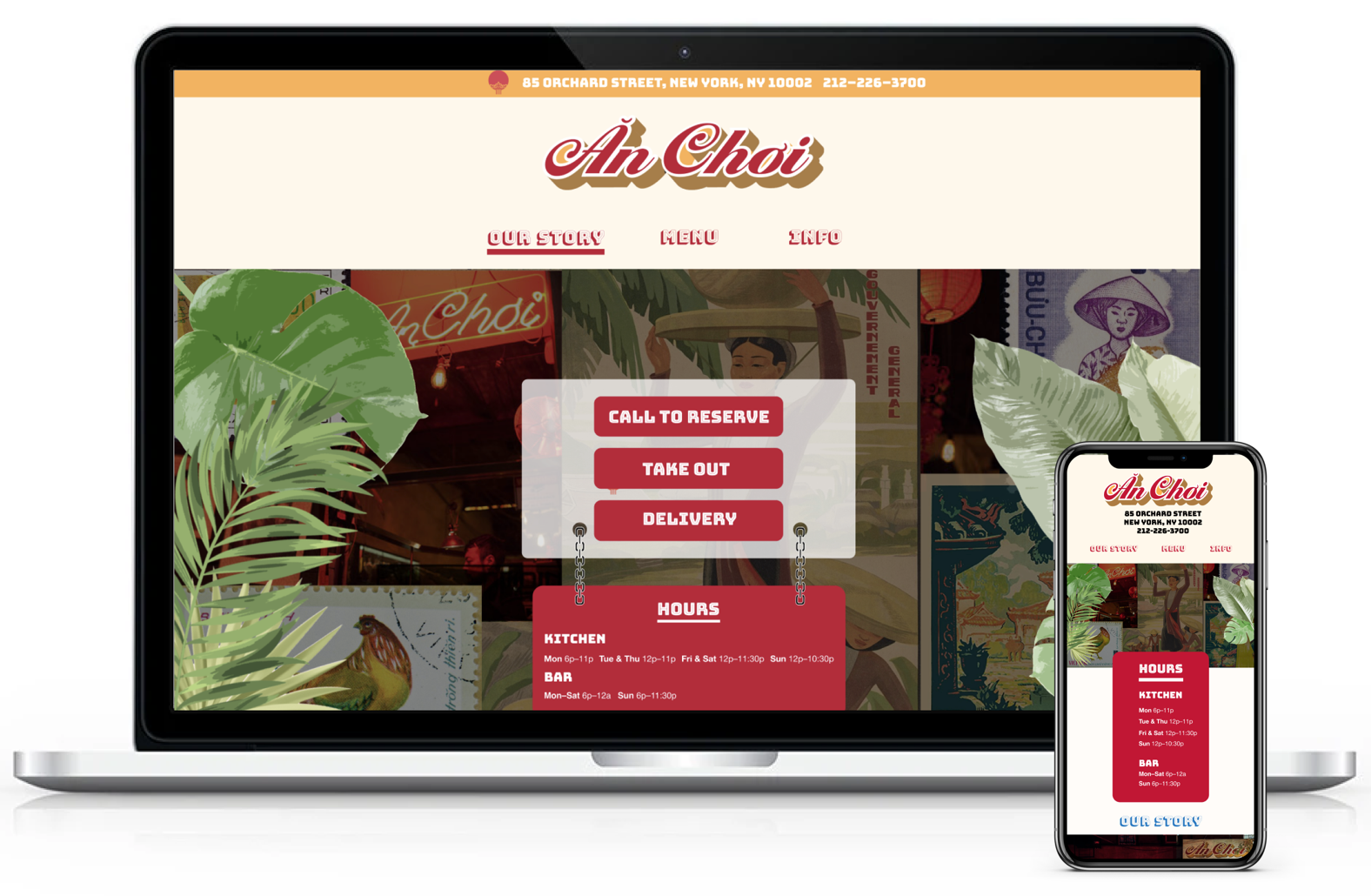
Our Redesign
Our redesign keeps the same street food style aesthetic as the current website, however, we’ve added a primary navigation and pertinent business information at the top for easy access to business information. Further, the hours of operations and call to action buttons (e.g., “Call to Reserve,” “Take Out,” “Delivery”) are prominently displayed to encourage patronage.

Important Design Elements:
Fixed header/logo so customers can always view An Choi’s address & number
Red underline denoting the section of the website that’s being viewed to increase user controllability, clarity, and findability
Hours of operation and call to action buttons (e.g., “Call to Reserve,” “Take Out,” “Delivery”) immediately viewable to encourage patronage — buttons link out to the appropriate third party websites
Keeping the street food collage aesthetic of the existing website, but with a neater appearance
“Menu” section showcasing the most popular food items & drinks while also linking out to the full menu PDF for customers who want more details
“Info” section containing a map of An Choi’s location and social media links for customers who want to view more photographs or special events
Adequate color contrast and large enough text size to satisfy accessibility
Palm leaves (closed) that open upon landing on the website for a fun delightful animation to welcome customers
“Our Story” section describing the business and its owners
Testing & Design Iterations
Once coded, the developers updated the entire team with links to their deployed work. In response, the designers communicated aspects of the deployed website that required updating. Fortunately, we were able to work through these design issues with the developers so that both designers and developers understood the other’s visions or limitations. My team was satisfied with each subsequent website deployment - eventually the responsive website better matched our design concept and gave what An Choi’s customers need and want from a restaurant website.


Recommendations: Thoughts & Next Steps
🍜 Update coding to include our original design elements
Fixed bar underline for the specific navigation category item upon initial click rather than just appearing as a “hover” state
An Choi logo as a fixed header along with the primary navigation items
Clicking/tapping the An Choi logo navigates user back to the top of the website
Palm leaves animation upon landing on the website
Horizontal scrolling of restaurant photos
🍜 Create a smaller An Choi logo to better suit the responsiveness of the website
🍜 Most importantly, pitch our redesign to An Choi! Then, enjoy a nice meal with the team to celebrate our redesign victory.
Reflection: Lessons Learned
It’s imperative to demonstrate and thoroughly explain our designs to the developers. Specifically, we need to walk the developers through the prototype/concepts during handoff, visually specify the design callouts/details in the documents, and understand that what’s clear to designers could mean something entirely different to developers. If a design element is ambiguous, then the developers may “design it themselves,” which should be avoided at all costs.
Open and honest communication between designers and developers is very important. Specifically, discussing the available development possibilities and troubleshooting together was helpful to both sides.
Also, it’s best to check the website deployment on different browsers and devices as a responsive website may vary greatly on different platforms.