

UX Team Members
Bonnie: UX Researcher, UX UI Designer
Randy: UX Researcher, UX UI Designer
Jennifer: UX Researcher, UX UI Designer

Problem Space
Freelancers currently use a variety of resources to manage their finances. They cannot accurately keep track of all of their expenses, invoices, and taxes. If freelancers inaccurately calculate these items, then they may be penalized by the IRS/Governments for improper tax payments. How might we streamline financial processes and resources to help guide freelancers?
Hypothesis
Freelancers need a better way to streamline their financial processes in order to accurately track their expenses, invoices, taxes. They’d prefer to use a one stop shop product rather than using multiple resources so that they may better focus their energy on their freelance work.
Assumptions
Freelancers have a lot of expenses to track
Freelancers generate invoices and want to be paid in a timely manner by clients
Freelancers need to keep track of their quarterly tax payments
Freelancers need resources to help them navigate the freelance realm
UX Process


Exploring Self-Care Products & Understanding Users
Interviews

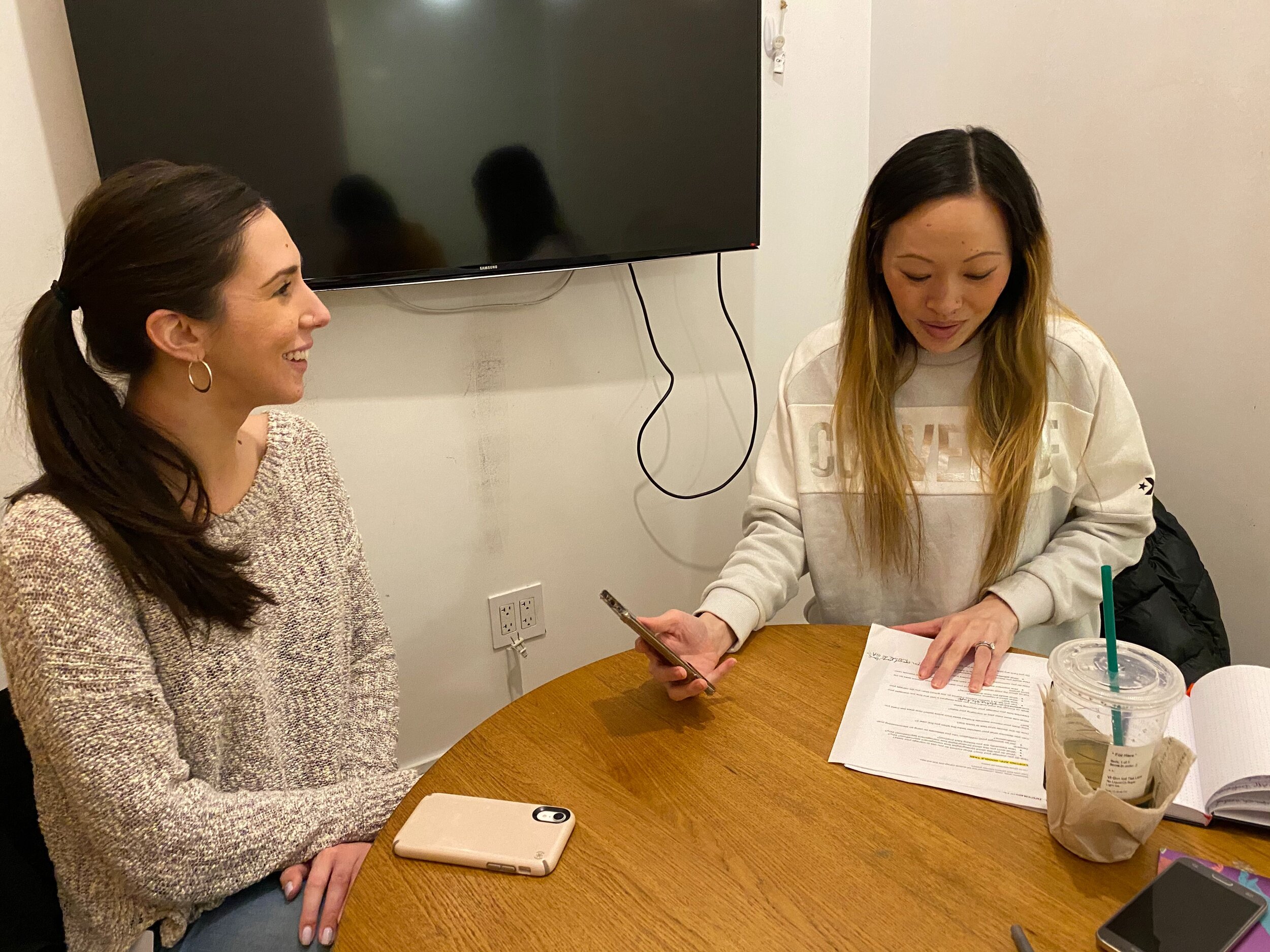
The goal is to understand how we can help streamline the financial process for freelancers. With the assistance of screener surveys, we interviewed 5 members of our target audience, i.e., freelancers who are monetarily compensated and file taxes as a freelancer. We wanted to get specific feedback about their needs, goals, pain points, and frustrations while interacting with financial management tools. Interviewees routinely found it difficult to get paid after they’ve completed a gig and without professional help, were utterly confused when determining their maximum write-offs. We also learned that networking was the most effective method in obtaining gigs, some states penalize freelancers who don’t pay quarterly taxes, and some in hindsight wished they had a signed contract. Also, there are no one stop shop freelance resources available for financial management, but they do tend to use Mint or Google Sheets along with other products.
Affinity Map

The affinity map helps us find patterns based on the thoughts and beliefs of all of our interviewees. We wrote down each of the facts/quotes gathered from our interviews on different post-it notes on a whiteboard, silently grouped them where they best fit so that we could notice trends, and then turned each trend group into an insight. Some of our findings include the fact that freelance work is best obtained by word of mouth and networking, they tap into multiple resources for guidance, some freelancers prefer manual expense tracking because of inconsistency in digital platforms or old habits, some freelancers prefer using accountants for their convenience and higher tax deductions, and it’s difficult keeping track of personal versus business expenses. We also learned that most interviewees don’t concern themselves with contracts as they rely on paper trails, they prefer hourly rates because it provides more clarity and control for themselves, they prefer using a full service platform to manage their invoices and expenses, it’s important to accurately track their taxes so they don’t get penalized, and they frequently face challenges when collecting payments for completed projects. By creating insights, we could better generate features to help freelancers as well as create a persona to represent our target audience’s goals, needs, pain points, and frustrations to guide our product design.
Persona

A primary persona represents our target audience’s needs, pain points, and goals so we can better understand our target audience. The persona is a personification of all our research data so that we have someone specific in mind to design for. The insights generated from our affinity map clarifies our target audience’s goals, needs, pain points, and frustrations. We consolidated all these attributes into our persona. Our team needs to design for a person who is a busy freelancer that needs a one stop shop to manage her finances so that she can accurately put away money for taxes, properly invoice clients, and get paid in a timely manner. By creating a persona, our team can narrowly tailor and effectively design our product to help freelancers achieve their financial management goals. With a persona, all team members are aligned about who our target audience is.
User Journey Map

We mapped out a scenario where our persona books a gig, works, invoices the client, receives payment, and files her taxes. We’ve identified that Fran’s emotions start going downhill after she invoices her client and waits months to be paid as well as attempting to navigate her tax returns. The map describes all of her emotional highs and lows during these interactions and allows us to identify opportunities for us to solve her issues. In order to create a journey map, we first described the steps our persona would take after booking a gig and up until she pays her taxes. These steps were later broken down in phases and system touch points (i.e., technology interactions) were noted. At each step, we evaluated whether our persona would have an emotional high or low and noted any available opportunities to help her with her day.
We determined that some of the ways Fran’s experience might be improved is by the following: a platform that offers the ability of a freelancer to enter gig details to create a contract, input hours worked, invoice clients, receive payments for their completed work, check payment statuses, network with other freelancers, and find helpful resources such as tax information.
Generating Features From Insights
Insights
A full-service platform is necessary to manage invoices and expenses or else time is wasted by using several platforms
Freelance work is found through word of mouth and by networking
It’s difficult locating relevant tax information and write-offs without the help of an accountant
It’s frustrating to chase down clients for payments, especially without a contract in place, so some freelancers never get paid
Features
A website that organizes the documents/information a freelancer needs from booking a gig to invoicing clients
A website offering resources to freelancers such as networking opportunities, workshops, and available jobs
A website that automatically creates a client-freelancer contract upon booking containing the essential terms/rate the client is required to “accept” for the job to start while also putting down a credit card for a “specific hold amount”
Brainstorming Potential Designs
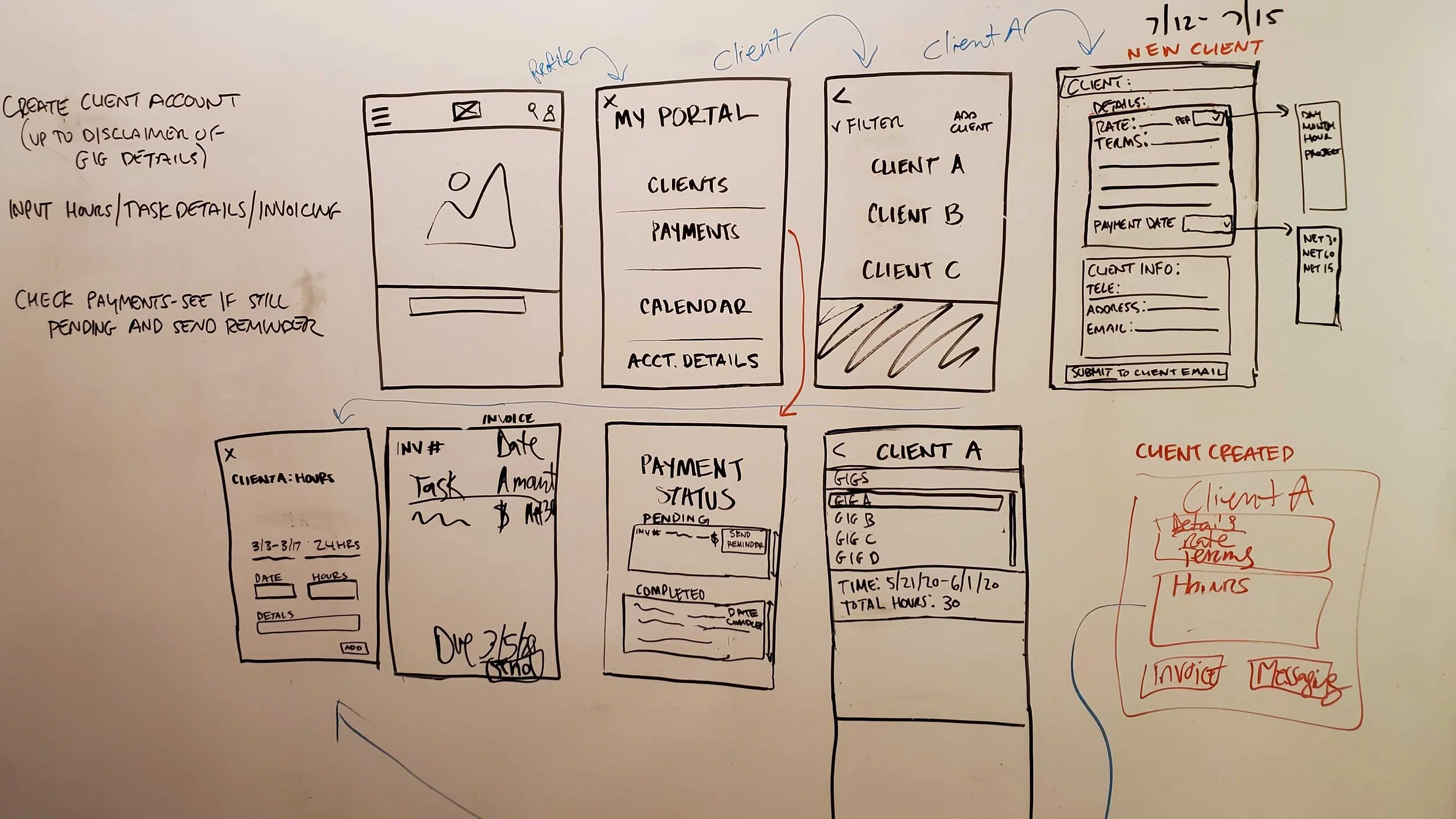
Design Studio Drawings
With specific features in mind as dictated by our research, our team participated in a design studio to quickly generate as many ideas as possible in a short amount of time. We went through one round of design studio where we each sketched silently for 5 minutes, presented our sketches to each other, critiqued each other’s designs for 1 minute, and then sketched again silently using the best ideas for the next sketch. We designed the user portal to contain a contract creator, invoice, and payment features as well as other vital freelancing resources. Each round was finalized when together we drew a final design agreed upon by everyone — we created the best redesign version incorporating the new features.
In the end, we together synthesized common design elements for our low-fidelity wireframes including: a contract creator, invoice, and payment features among other vital resources needed by freelancers.
Designing a Responsive Website for Freelancers

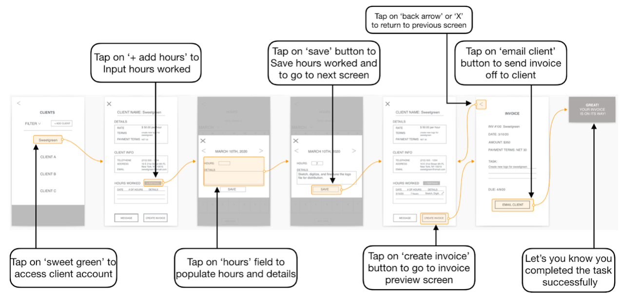

Based on the ideas generated in design studio, our team designed the above screen concepts, visualized as the three tasks presented in our mid-fidelity concept usability testing. The arrows show the “happy path” a user would take to complete the tasks directly (i.e., without any deviation).
Usability Testing Results
Round 1 (Mid-Fi Design):

For the first round, all users successfully completed their tasks however the majority of users indirectly completed their tasks. The overwhelming reason users did not complete these tasks directly was because there was confusion on what was contained in the “hamburger menu” versus the “profile icon” — however this was a minor issues because it didn’t prevent users from completing their task.
Key Takeaways
Many users enjoyed the “remind” feature, which reminds their client that payment will be due soon
Users’ first reaction was to navigate towards the hamburger menu to locate what they need
Users pointed out the difficulty in deciphering the difference between the functions of the hamburger versus portal menu
Some of the buttons were too small or were not clear that they were in fact buttons
Users were confused by the task language, which related back to the actual text used on the screens
Some users found the separation of clients and payments in the portal counterintuitive
Next Design Iteration: Combine the “hamburger menu” with the “my portal” menu so that users don’t waste their time trying to learn the difference between these menus, the “email client” button should have its text updated to say something more descriptive like “send contract to client” and/or contain a “preview” before sending the contract/disclaimer to prevent user hesitation/confusion, label the “contract” page as such so that users can quickly understand what it is, increase the “add hours” button size by 50% along with color contrast to capture the attention of users so it doesn’t get “lost,” and consider moving payment statuses within the client account page as well as in the “payment” page.
Round 2 (Hi-Fi Design):

For the second round, all users successfully completed their tasks with the majority of users completing their tasks in a direct path. For task 1 there was some confusion with what the “gig” category link entailed, a minor issue. For task 3, a couple users went to the clients page to look for the payments status, rather than going to the “payments page,” which was also a minor issue. Compared to Round 1 — all tasks in Round 2 were successfully completed in half the amount of time and rated as much easier.
Key Takeaways
Almost all users were interested in the “my portal” button because it stood out in design/color and also were curious about the “hamburger menu” options
Two users thought that freelancers could create new client accounts in “gigs” rather than checking first in “my portal”
Most users thought the website was helpful as it’s an all in one platform with a variety of freelance tools/resources
All users, in their first impression review, knew immediately what the website was all about and thought the website was visually pleasing and/or easy to use
One user wanted to check invoice payment status under “clients” rather than on the “payments” page while another user wanted more line item clarification on the “payments” page
Next Design Iteration: The “gigs” link should be renamed to “jobs available” or “open jobs” to better describe its contents, create an option to import that client’s logo to show up on the “clients” list page and “client account summary” in order to really personalize the “my portal” features for users, add an additional column on the “payment status” page specifying more details about the “pending payment” (e.g., status of “unpaid,” “paid,” or “invoice in progress” on the line item of the invoice to clarify the status of that particular invoice), and add the invoice payment status list feature on the actual client account page for users who prefer to view payment statuses by a particular client rather than by all invoices for all clients.
Product Concepts & Prototypes Iterated

Cheddr is responsive website — here’s the mobile view to the left and the desktop view to the right.
Annotated Task WireFlows (Mobile & Desktop Views)


Recommendations: Thoughts & Next Steps
The Cheddr responsive website would greatly benefit from existing API’s relating to freelance job boards, bank account integrations for quick payments (e.g., Bank of America, Chase, Wells Fargo, etc.), and a partnership with TurboTax among other resources in order to make a more diverse and usable experience for the user.
Our team reviewed all our research, design, and testing results and boiled everything down to a high-level palatable list of next step suggestions: reiterate the Cheddr responsive website design based on our last usability testing round 2 key takeaways/suggestions, continue with additional rounds of usability testing on current freelancers in order to get the best and most specific feedback with the goal of validating the design/features, and incorporate the necessary API’s.
Reflection: Lessons Learned

A one stop shop financial management product catered to freelancers would be revolutionary. By way of interviews, it’s apparent that freelancers currently must use multiple resources in order to properly manage their finances, which is not ideal.
It’s important to validate product designs via usability tests. Cheddr’s design has been greatly elevated from testing feedback as surprising issues were brought to our attention - intuitive features to designers aren’t always intuitive to users.
Designing with “Mobile First” in mind is the best practice when designing a responsive website in order for it to look its best at every break-point.