

UX Team Members
Bonnie: UX Researcher, UX UI Designer
Jennifer: UX Researcher
Elizabeth: UX Researcher
Problem Space
Students are very busy with their academic, family, and social obligations. They need better time/task management resources in order to achieve a work/life balance. How might we help provide Students with one method to efficiently and reliably manage their busy academic schedules so that they may have a more productive and holistic life?
Hypothesis
Students have difficulty managing their academic, social, and family obligations using their current methods. They need one method to efficiently and reliably manage their busy academic schedules in order to have a holistic life.
Assumptions
Busy academic schedules make it hard to have work/life balance.
Students are frustrated with their current calendar management methods.
Students working in groups need to manage their different tasks with each other.
Tasks have different priority levels and need to be differentiated.
Simple calendar reminders are insufficient for the needs of students.
Many different management methods don’t address students’ needs.
Many students are very familiar with technology and use some sort of digital calendar.
A calendar method helps students stay on track with their projects/tasks and what to expect in the upcoming weeks.
UX Process


Exploring Calendar Apps & Understanding Users
Interviews

The goal is to understand how we can help students efficiently and reliably manage their busy academic schedules so that they may have a more productive and holistic life. We determined that our target audience for user interviews would be current students, part or full-time. We created an interview guide containing 6 information goals in order to gain more insight on the issue at hand. Then, we located and interviewed 6 current students who were familiar with calendar apps in order to get specific feedback about their needs, goals, pain points, and frustrations pertaining to their time management methods. Interviewees routinely find it difficult to use a single calendar to manage all their tasks. Many used at least two different forms of calendars. For instance, the Google Calendar App for their social and family obligations while using Microsoft Outlook or physical calendars for work related obligations. A single calendar didn’t contain all the features that users wanted in order to best manage their time and tasks. By understanding what students like and dislike about their time management methods, we could redesign the Google Calendar App to be better, with more of the features they need. Many interviewees stated that their main calendar app could not show when a task was completed and that they simply had to delete tasks as “done,” but indeed wanted to keep tasks on their calendar for future reference. They also liked prioritizing their tasks by urgency and thought that color coding would be beneficial. Although students generally preferred using the Google Calendar App, these types of features were missing and prevented them from using this app as their only calendar. Thus, it would be helpful to update the Google Calendar App with features that allowed users to distinguish their tasks by uncompleted versus completed or urgency in order to assist students in achieving their academic goals.
Affinity Map

The affinity map helps us find patterns based on the thoughts and beliefs of all of our interviewees. We wrote down each of the facts/quotes gathered from our interviews on different post-it notes (color coded by interviewee to show variety), stuck them to the wall, silently grouped them where they best fit so that we could notice trends, and then turned each trend group into an insight. Some of our findings include the fact that our users want to be able to strike-through or check-off completed tasks in their calendar. They don’t like when their calendars have issues syncing with other programs. We also learned that users preferred the Google Calendar App over other calendars such as the Apple Calendar App. By creating insights, we could better generate features to help students as well as create a persona to represent our target audience’s goals, needs, pain points, and frustrations to guide our product design.
Persona

A primary persona represents our target audience’s needs, pain points, and goals so we can better understand our target audience. The persona is a personification of all our research data so that we have someone specific in mind to design for. The insights generated from our affinity map clarifies our target audience’s goals, needs, pain points, and frustrations. We consolidated all these attributes into our persona. Our team needs to design for a person who has hectic academic schedule, wants a single calendar to quickly show her what she needs to accomplish, and appreciates having a work/life balance. By creating a persona, our team can narrowly tailor and effectively design our product to help students efficiently manage their time and tasks. With a persona, all team members are aligned about who our target audience is.
Generating Features From Insights
Insights
Users derive satisfaction from checking off completed tasks in a hard-copy notebook.
Users want the perks of a hard-copy notebook while they are using digital calendars.
Users find color coding their tasks helpful because they can quickly prioritize their day.
Features
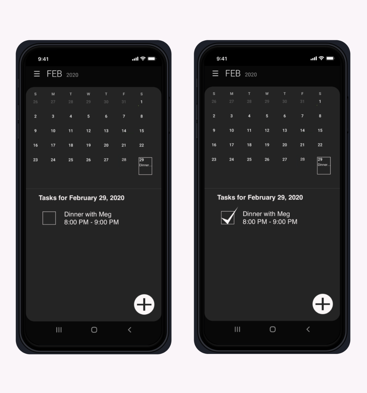
Ability to checkmark completed tasks in the Google Calendar.
Ability to strike-through completed tasks in the Google Calendar.
Red border/shading/icon to distinguish urgent tasks while in the general calendar view.


Brainstorming Potential Designs
With specific features in mind as dictated by our research, we generated as many ideas as possible. Once our ideas were exhausted, we collectively chose the best redesign containing one new feature for our minimum viable product. In the end, we created an upgraded Google Calendar App with a settings option to activate the “checkmark” feature, an empty box next to each uncompleted task, and quick ways to checkmark the box for completed tasks. We would aim to keep the clean minimalistic look of the calendar while elegantly incorporating our checkmark feature into the existing user interface design along with clear descriptions and labeling.
Designing A New Feature For The Google Calendar App


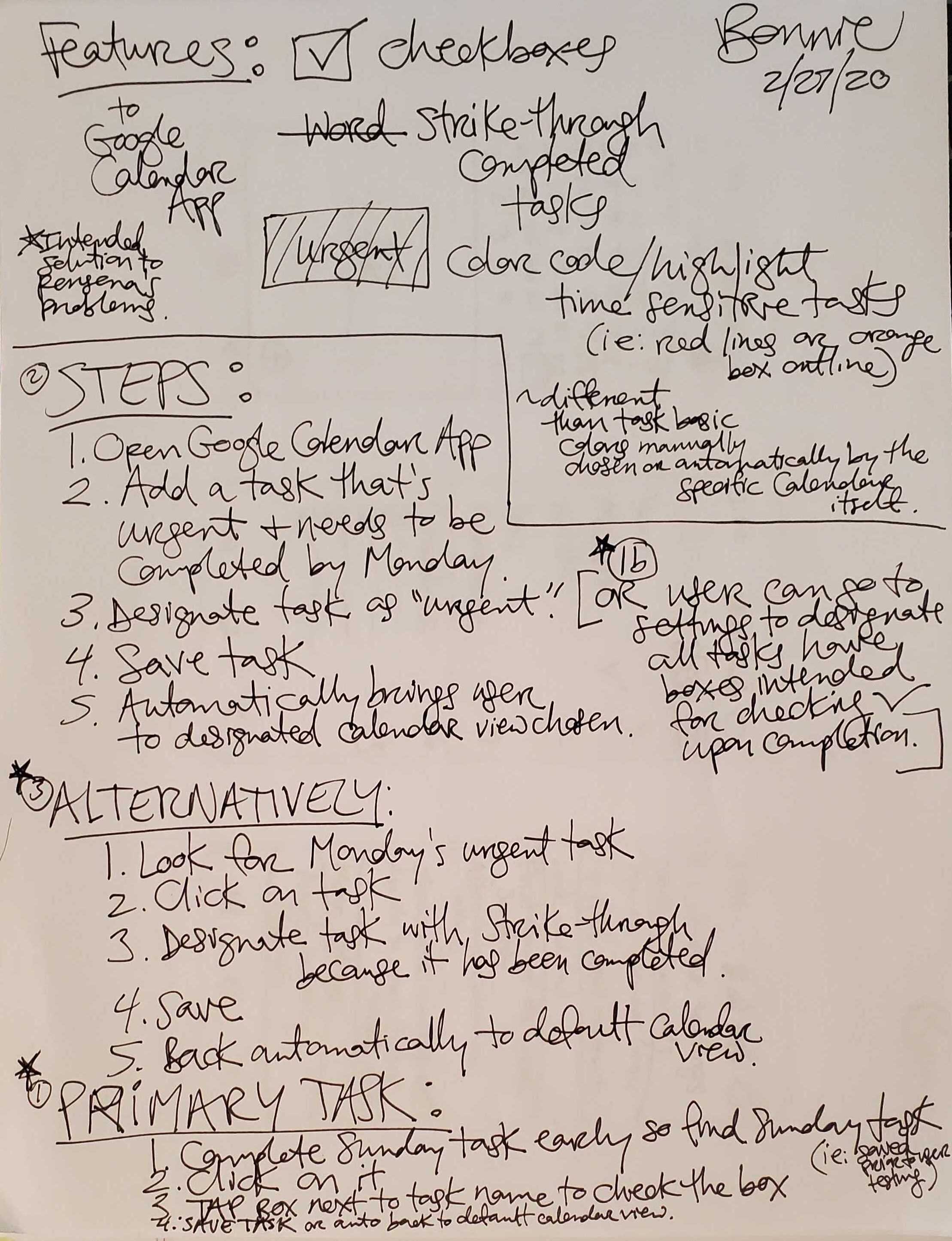
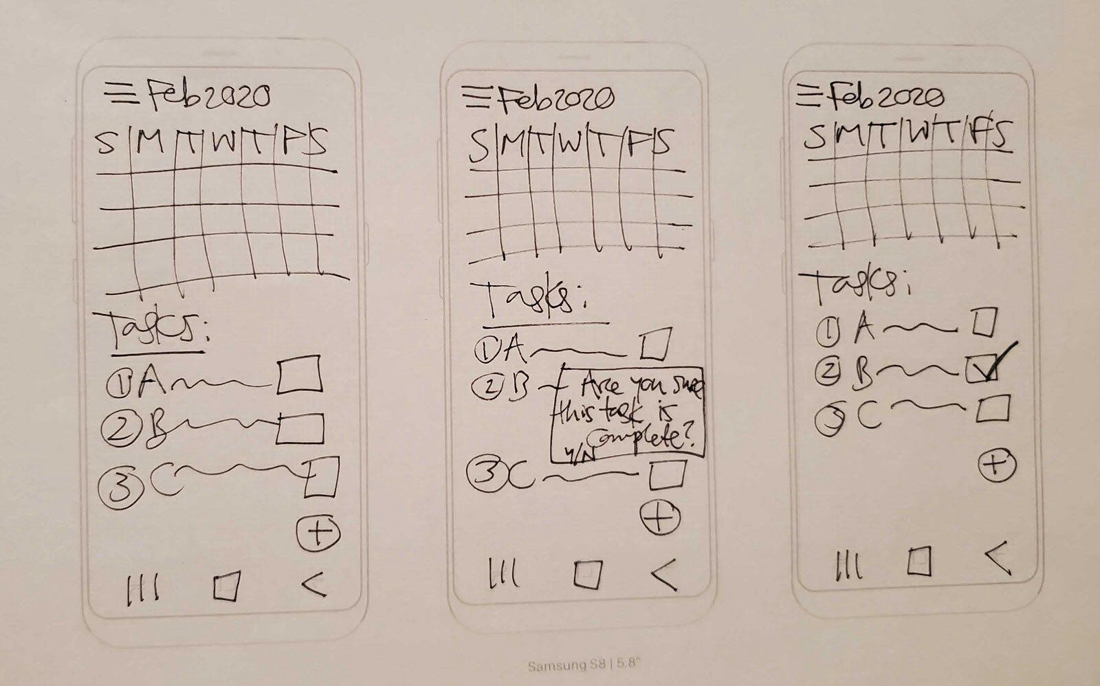
Based on the ideas generated, our team designed the above screen concepts, visualized as the three tasks presented in our low-fidelity concept usability testing. The arrows show the “happy path” a user would take to complete the tasks directly (i.e., without any deviation).
Usability Testing Results
Round 1 (Low-Fi Design):

All users successfully completed Task #1 - We learned that the activation setting for the checkmark feature was placed in an optimal location as users easily located the option for the feature's activation. The "yes/no" toggle activation of the feature was intuitive and straightforward to users. Regarding Task #2, once users added a task to the calendar, we learned that the checkmark is indeed a familiar icon/method for users. Lastly, based on Task #3, we learned that the checkmark is an easy feature to use and brought value to users.
Key Takeaways
Most users found the checkmark feature helpful for distinguishing uncompleted tasks from completed tasks.
One user was indifferent to the checkmark feature, but admitted that it was a helpful for those users who cared to distinguish their tasks.
Users found the prototype easy to navigate as it contained recognizable and familiar icons.
Due to the nature of this low fidelity of this prototype (i.e., no color, strange handwriting, etc.), users took extra time to read the text when viewing the calendar setting options.
All users were either confused, curious, intrigued, distracted, or misunderstood the “smile face” icon appearing near the task list.
Many users weren’t familiar with the android/Samsung Galaxy platform.
Next Design Iteration: Vertically stretch the “monthly calendar view” to incorporate task previews in the calendar boxes as well as more detailed descriptions underneath the calendar, enlarge the “add an event” icon, eliminate the “no events today smile placeholder,” relocate the numerical day of the month next to the listed month in the calendar’s title, eliminate the partial view of the calendar numbers when in the hamburger menu, create a “Calendar View” category above “Year, Month, Week, Day” to condense the setting choices, better distinguish categories and choices by color or font for an easier/faster read, add pop-up notifications for non-functional buttons/icons, and create a hotspot for the words “Mark Finished” so that both left and right handed users are easily able to mark a task as completed (i.e., both the empty box and words “Mark Finished” can create a checkmark for the task).
Round 2 (Mid-Fi Design):
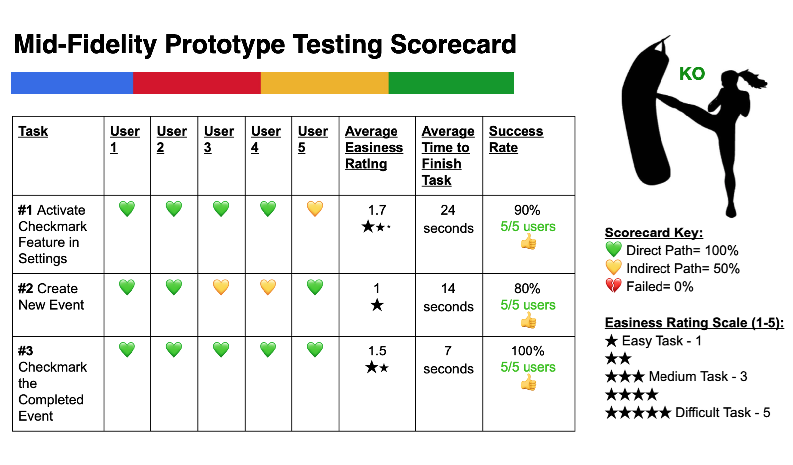
For the second round of testing, we conducted the same scenarios & tasks as the Round 1 in order to compare our data sets. The scorecard shows the task success rate in Round 2. Although all 5 users successfully completed the tasks, there were a few indirect paths. From Task #1, we learned adding different fonts and design elements to setting descriptions assisted users in finding the checkmark setting much faster. Task #2 showed that the enlarged “add event” icon made it easier for users to create new tasks. From Task #3, we learned that a larger hotspot for checkmarking tasks worked well for users.
Key Takeaways
The menu icons and options were recognizable and intuitive.
The wording of the checkmark option in the settings menu needs to be clearer and more concise for easier discovery.
Activating the checkmark setting took the longest time to complete because more thought and reading was required.
Checkmarking a task as complete had 100% direct success because everyone “knew” how to “checkmark the box.”
All users noticed the large plus sign used to “add new tasks” as well as the universal hamburger menu icon.
Taking out the “add a sticker icon” and replacing it with “no events today” was beneficial to usability.
Users found the toggle button for activating the checkmark feature easy to use.
The prototype did what users expected it to do.
Next Design Iteration: Reduce the size of the checkmark and box by 20% or whatever the icon heuristics are for Androids and iPhones, add color/font variations/color contrast to menu options along with a more zoomed in view of the monthly calendar, alter the wording for the checkmark feature option in the settings menu to be more concise/clear, and update the notification pop-ups to be timed to disappear immediately after they’re activated.
Product Concepts & Prototypes Iterated
Mid-Fidelity Concept

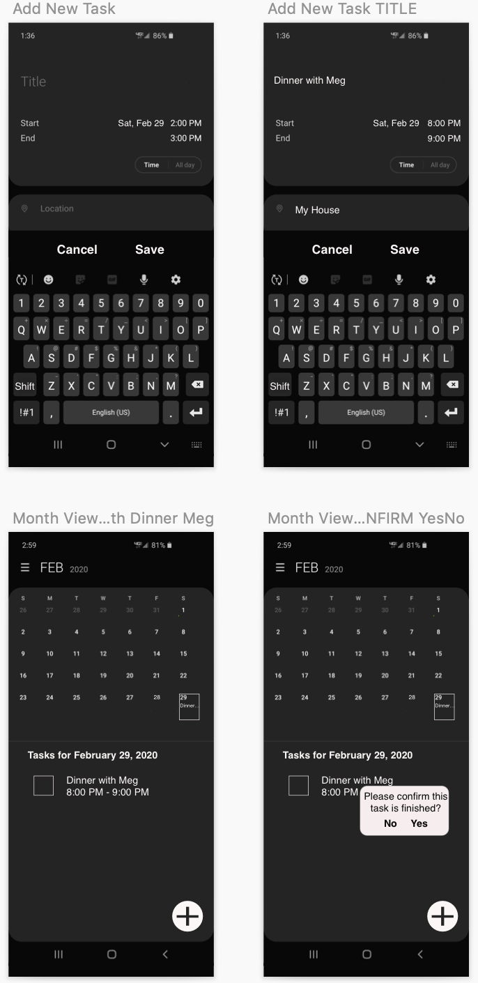
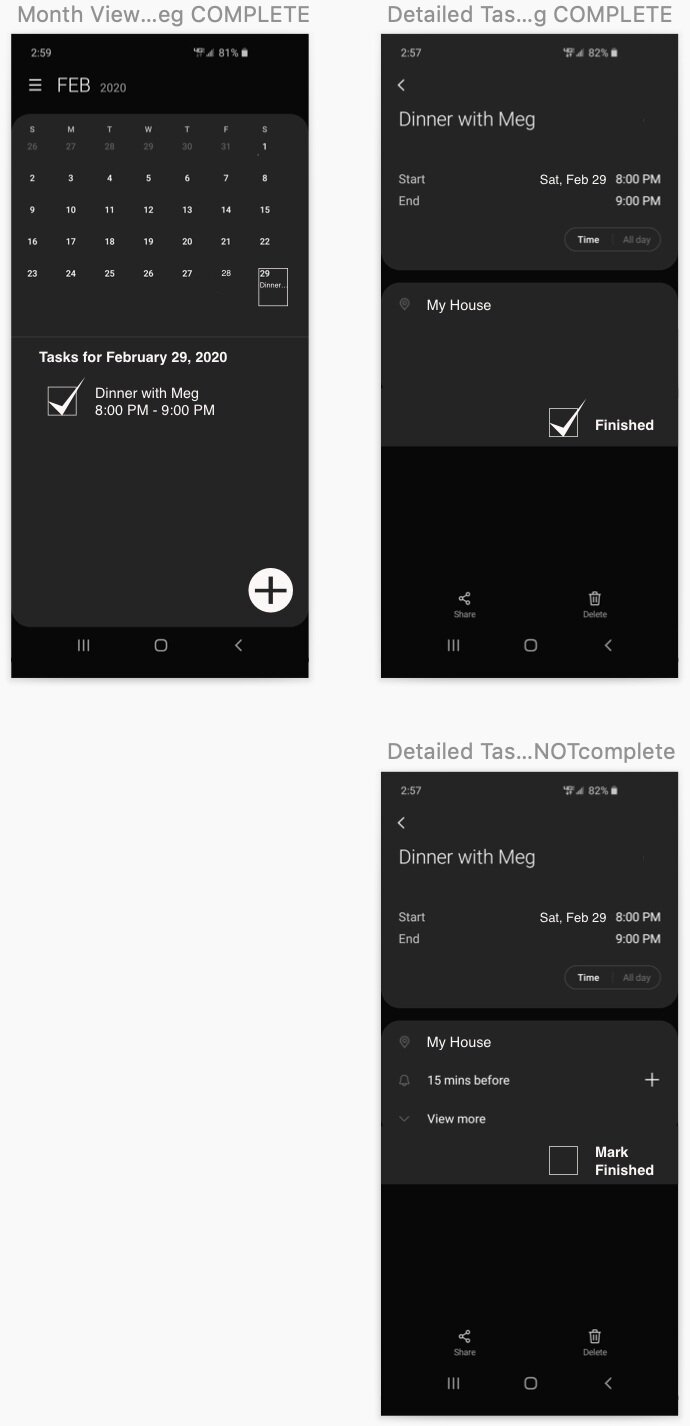
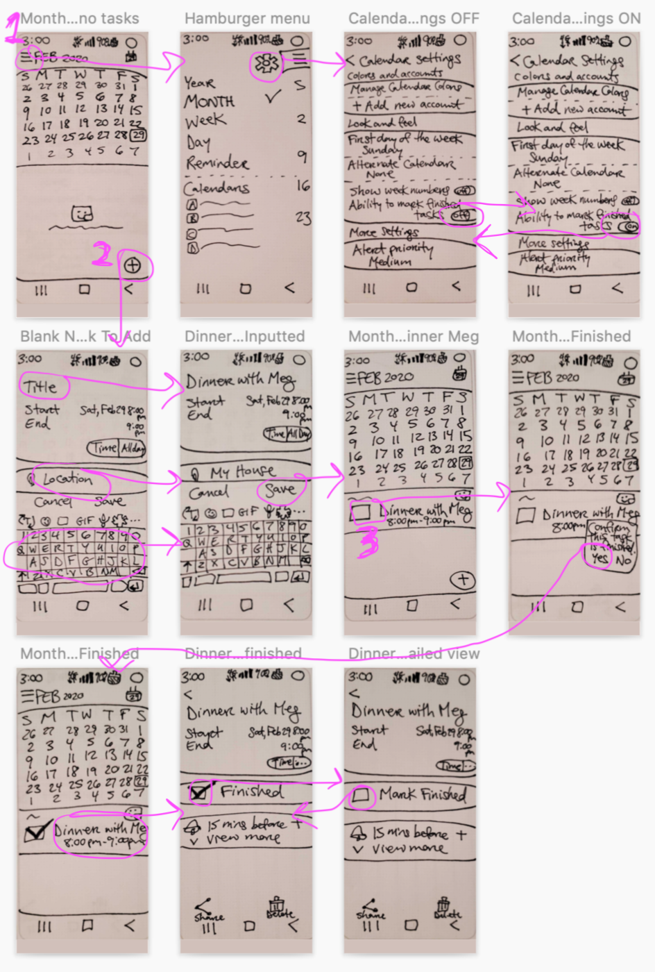
Notification Pop-ups

Notification pop-ups appear when users tap non-functional buttons or icons (i.e., to account for situations where users deviate from the “happy path”). They provide users with constructive feedback in order to prevent frustration while navigating the prototype.
Mid-Fidelity Screen Flow

This screen flow describes how this mid-fidelity concept was prototyped — all 3 task user flows can be seen here. The purple circle indicates a user tap/touchpoint while an arrow points to the connecting screen. Annotations explain touchpoint functions.
Recommendations: Thoughts & Next Steps
Fortunately, we’ve discovered that the checkmark feature distinguishing completed tasks from uncompleted (i.e., active) tasks in the Google Calendar App contains high usability so it would be beneficial to continue iterating and testing our design.
All usability testing participants appreciated that we thoroughly and thoughtfully prototyped the design so that the great majority of the “tappable” icons/buttons were responsive, items were in logical places, buttons/icons were familiar, tasks were clear, and the redesigned app did exactly what users expected.
In designing a hi-fidelity prototype, the functionalities and basic design of the mid-fidelity prototype should be kept, but with focused changes to the color contrast of icons and text along with font and spacing variations as well as wording choice upgrades.
In subsequent usability testing rounds, it would be very beneficial to find participants who routinely use the Google Calendar App and desire to distinguish their completed tasks from uncompleted (i.e., active) tasks in order to get the most valuable feedback regarding the checkmark feature.
We want to create a great feature that’s helpful and specifically tailored to the users/target audience of individuals who would be satisfied checkmarking off completed tasks in order to keep their calendars and lives more organized. The checkmark feature would be extremely valuable to busy students who want to exclusively use the Google Calendar App.
Reflection: Lessons Learned

Low-fidelity paper prototypes are a quick way to test out designs, however, the messy nature of handwriting can be really distracting to users. It would be good practice for the team member with the best penmanship to sketch the designs in order to obtain the best usability testing results.
It’s beneficial to prototype pop-up notifications for non-functional buttons/icons to communicate to users their efforts have been acknowledged and to know exactly what aspect of the prototype they’re interacting with.
When interviewing target audience members, it’ll save you and that potential participant time by asking 1-2 questions beforehand to make sure they are indeed part of your target audience. The strongest insights leading to feature design come from your target audience rather than from individuals who may not be familiar with your type of product.
