Reply.Ai's "Help Center" Widget Redesign
The “Help Center” assists customers in such a way that they accomplish many of their online order needs within the widget so they aren’t resorting to long wait times in order to speak with a customer representative. The improved “Help Center” increases “ticket deflection” rates to lessen the burden on customer service representatives and contains sufficient streamlined processes for such aspects as returns or missing items.


Who is Reply.Ai?
Reply.Ai’s approach to “Help Centers” deliver smarter and faster customer service by providing automated self service tools & intuitive FAQ’s. Reply.Ai has three main products: (1) Chatbot,(2) Agent Assist, & (3) Ticket Deflection. The ultimate goal is to reduce customer frustration, save customers time, and to lessen the workload of already congested customer service centers.
UX Team Members
Bonnie: UX Researcher, UX UI Designer
Lenny: UX Researcher, UX UI Designer, Scrum Master
Elizabeth: UX Researcher, UX UI Designer

Problem Space
Customers are disappointed in their customer service experience relating to online orders, missing items, and returns among other issues. They can’t locate the relevant information and resort to long wait times to speak with a customer service representative in order to resolve their issues.
How might we provide customers like our persona with a simple and streamlined way to receive accurate and relevant information relating to online orders?
Hypothesis
We’ve hypothesized that many customers, who make online purchases, need to adjust or review their orders, and prefer to do so without speaking with a customer service agent. They want their questions and concerns answered immediately.
Assumptions
Customers are frustrated or confused when attempting to return items in their order
Customers are frustrated or annoyed when they need to talk to a customer service representative, especially when placed on hold for long periods of time
Many FAQ pages are poorly laid out in a way that customers cannot locate the information they need
Customer service representatives are overwhelmed by the amount of tickets by customers who have questions or concerns
UX Process


Exploring the “Help Center” & Understanding Users
Interviews

The goal is to understand the target audience’s experience with “Help Centers,” customer service, and FAQ pages. We created an interview guide and interviewed 11 online shoppers who were familiar with customer service in order to get specific feedback about their needs, goals, pain points, and frustrations while interacting with help centers. Interviewees routinely find it difficult to locate the information or processes they need when relating to online orders and call customer service as a last resort in an attempt to resolve their issue. By understanding what customers like and dislike about help centers, we could redesign the “Help Center” to be the best version of a help center so that customers don’t need a customer service representative with long wait times to resolve their online order issue as they can do it themselves. Thus, automated processes need to be straight forward and FAQ pages need to be accessible.
Affinity Map

The affinity map helps us find patterns based on the thoughts and beliefs of all of our interviewees. We wrote down each of the facts/quotes gathered from our interviews on different post-it notes on a Miro board, silently grouped them where they best fit so that we could notice trends, and then turned each trend group into an insight. Some of our findings include the fact that our users want as few steps as possible when dealing with customer service or returns. They did not like contacting customer service or giving feedback in reviews. We also learned that users need FAQ’s to be simple and easy to use. By creating insights, we could better generate features to help customers as well as create a persona to represent our target audience’s goals, needs, pain points, and frustrations to guide our product design.
Persona

A primary persona represents our target audience’s needs, pain points, and goals so we can better understand our target audience. The persona is a personification of all our research data so that we have someone specific in mind to design for. The insights generated from our affinity map clarifies our target audience’s goals, needs, pain points, and frustrations. We consolidated all these attributes into our persona. Our team needs to design for a person who is money conscious, needs quick resolutions to her online order issues/concerns, and wants to avoid the necessity of long wait times to speak with customer service. By creating a persona, our team can narrowly tailor and effectively design our product to help customers resolve online order issues or concerns. With a persona, all team members are aligned about who our target audience is.
User Journey Map (Original versus Revised)


We mapped out a typical scenario where our persona had to return an item that she bought online in order to better visualize how the “Help Center” could help her accomplish her goals in a specific instance. The map describes all of her emotional highs and lows during this interaction and allows us to identify opportunities for us to solve her issues. In order to create a journey map, we first described the steps our persona would take before, during, and after deciding to return her item. These steps were later broken down in phases and system touch points (i.e., technology interactions) were noted. At each step, we evaluated whether our persona would have an emotional high or low and noted any available opportunities to help her with her day.
We determined that some of the ways Sara’s experience might be improved is by: providing a return item link on the order info page or in her order confirmation email, better FAQ categorizing along with a search feature on the help page, creating an automated item return system, creating an automatic feedback request, and by adding a link to get a return label mailed or receive a QR code for an easy package drop off without a label.
The revised journey illustrates how much our persona’s emotional experience has changed and improved with the use of the “Help Center.” Like the original user journey, we outlined the steps Sara would take to return her item, but with the opportunity to interact with Reply.Ai’s “Help Center.” By using the “Help Center,” Sara’s user journey has drastically improved. Specifically, in the phase of her day where she interacts with the “Help Center,” Sara now has a very positive emotional experience, especially when she realizes she no longer needs to call customer service. Her emotional low point has now transformed into a high point. By mapping out the revised user journey, our team could better visualize how much the “Help Center” redesign actually assists target users in accomplishing their goals.
Heuristic Evaluation
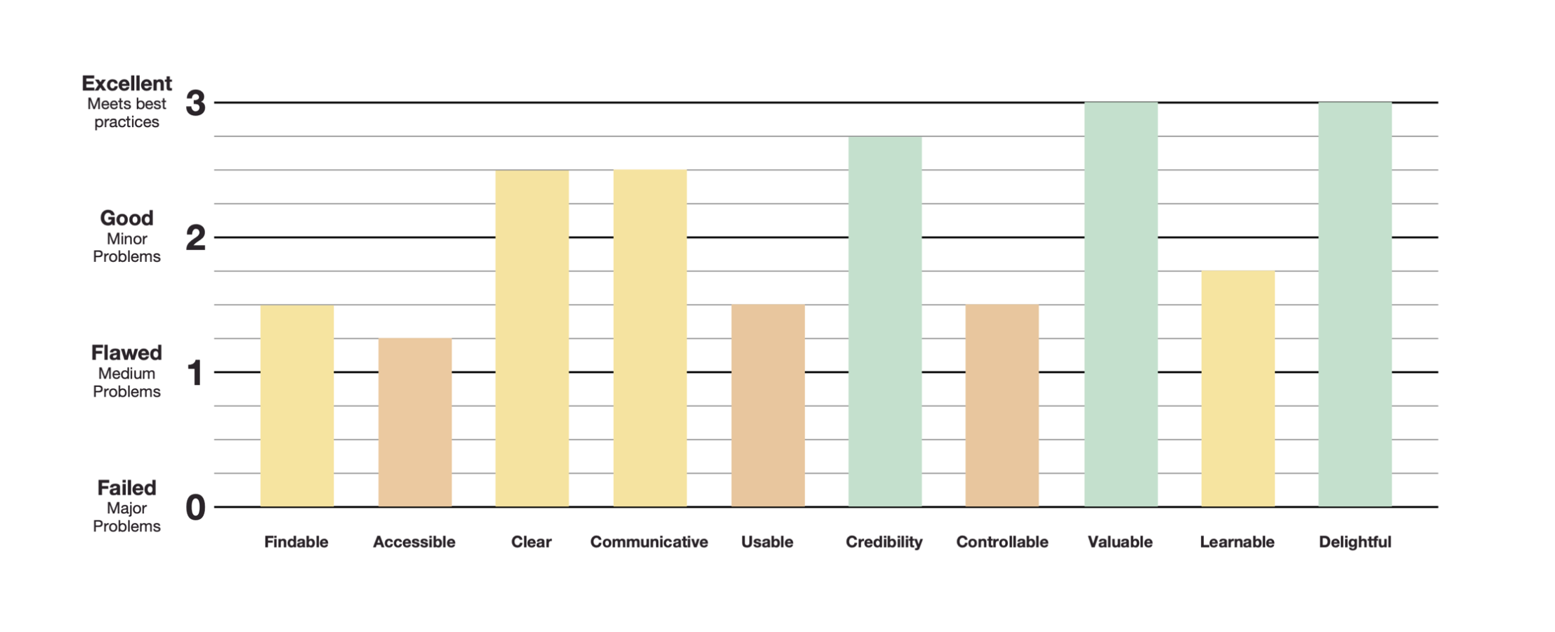
The goal is to discover known UX Design issues by evaluating 10 heuristic elements - findable, accessible, clear, communicative, usable, credible, controllable, valuable, learnable, and delightful. By evaluating the main pages of the “Help Center,” then filling out a heuristics chart, and ultimately denoting elements as minor issue, medium issue, major issue, or meets best practice enlightens us on what elements the product could improve on the most. The Client’s “Help Center” meets best practices in areas such as credibility, value, and delightfulness. On the other hand, it could improve in its accessibility, usability, and control. By conducting a heuristic evaluation, we can eliminate known UX Design issues prior to target users even viewing a prototype so that they can focus on user experience issues that might not be as apparent to us, which in return will help us better reiterate the design in their favor.
Competitive Feature Analysis

The goal is to determine what features consumers reasonably expect from “Help Centers” and FAQ pages as evidenced by competitor websites. We evaluated the websites of the competitors our Client mentioned that had good “Help Centers”/FAQ pages to see what features were present and noted any commonalities. The biggest takeaways were that our Client’s “Help Center” could use the following features: a menu of helpful topics available while reading answers, automated returns or refunds, automated reporting if missing items, and customer service star rating feedback. Knowing this information is for the benefit of the consumer because it will help us redesign the “Help Center” to minimum standards so that consumers can more easily and intuitively navigate to find or accomplish what they need.
Generating Features From Insights
Insights
Users only give feedback at optimal times.
Users want simple ways to deliver feedback.
Users only provide feedback when they feel strongly about it.
Users need clear and easy FAQ’s.
Users want fewer steps for online processes.
Features
Add automatic pop-up widow upon exiting the “Help Center”
One click feedback.
Provide icon ratings along with optional comment box.
Intuitive categories, clear labels, and bolded text.
Streamlined steps and optimal information levels or questions.
Brainstorming Potential Designs

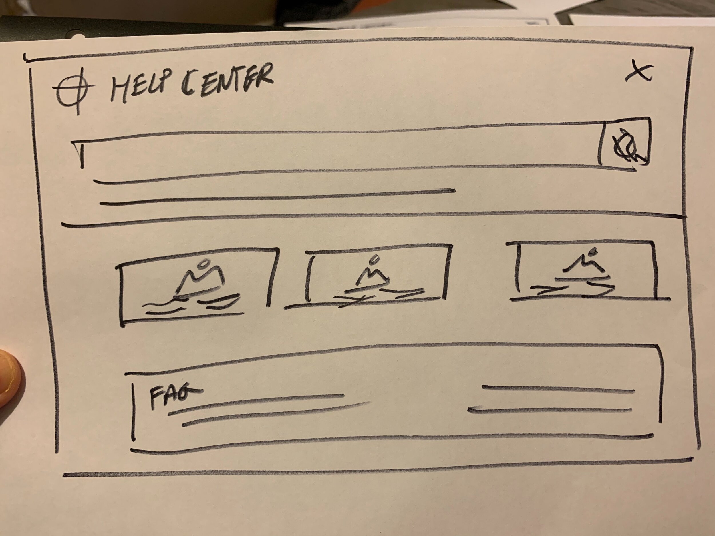
Design Studio Drawings
With specific features in mind as dictated by our research, our team, including our client Reply.Ai’s Ibon, participated in a design studio to quickly generate as many ideas as possible in a short amount of time. We went through two rounds of design studio where for each round, we each sketched silently for 5 minutes, presented our sketches to each other, critiqued each other’s designs for 1 minute, and then sketched again silently using the best ideas for the next sketch. We designed the homepage in the first round and designed the return process in the second round. Each round was finalized when together we drew a final design agreed upon by everyone — we created the best redesign version incorporating the new features.
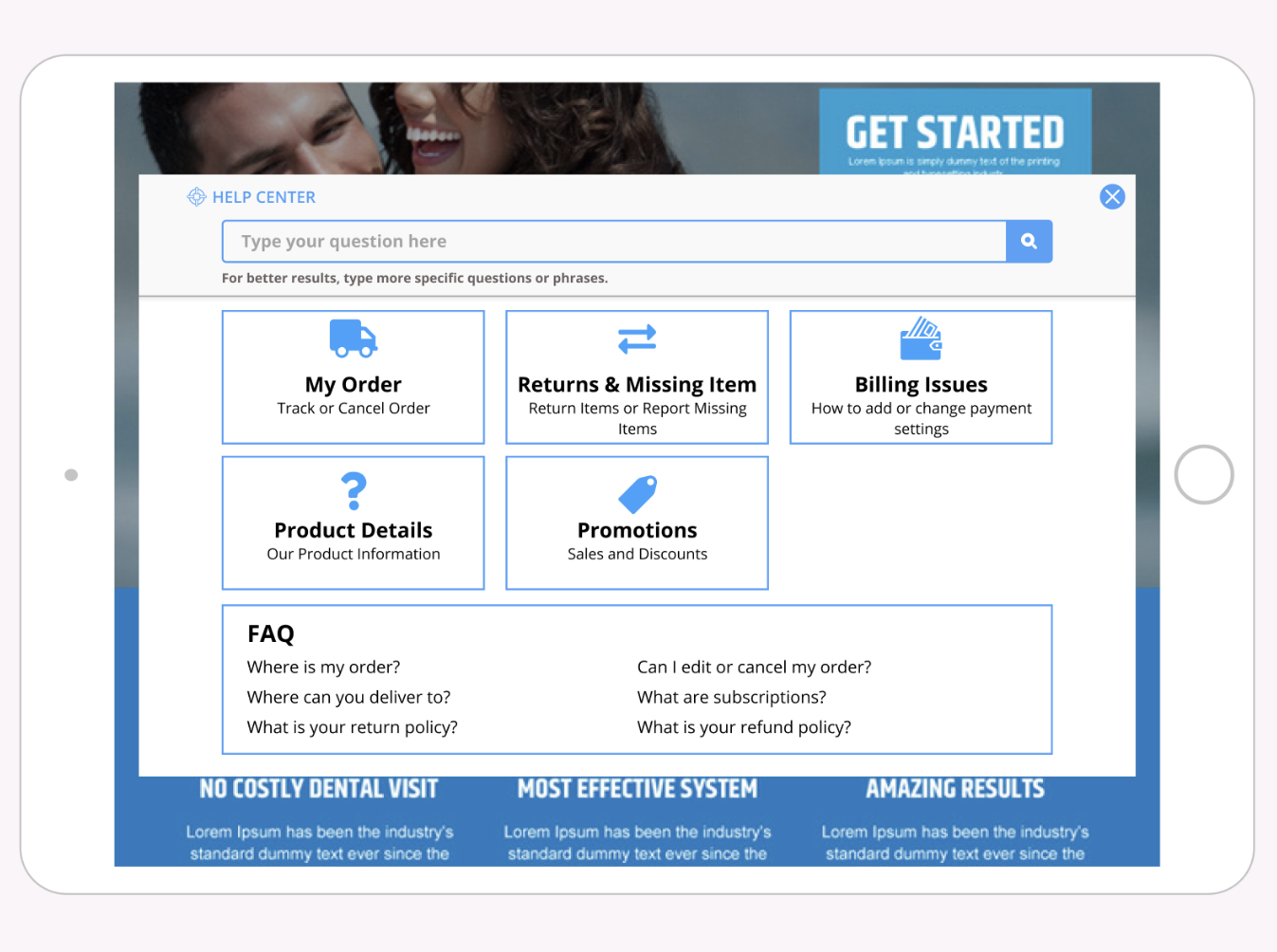
In the end, we together created a homepage with clear large button categories, FAQ section on the homepage, and a streamlined return process. We would aim for a clean minimalistic approach to our user interface design combined with clear descriptions and labeling.
Designing a User-Friendly “Help Center”


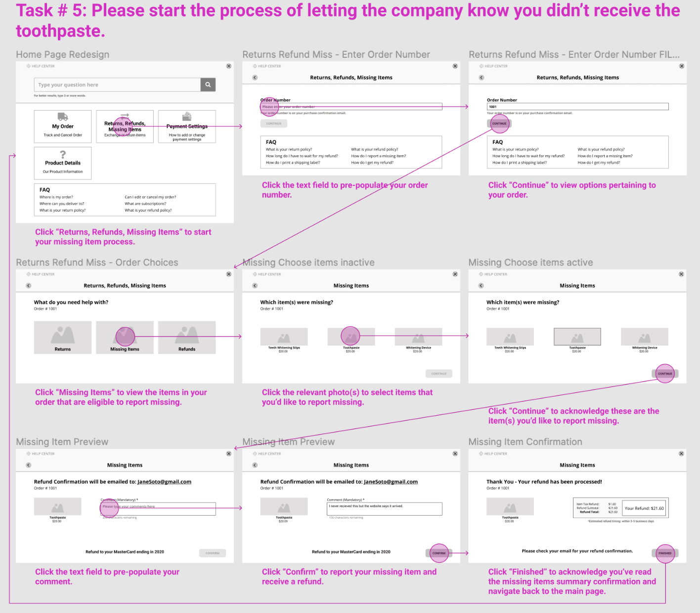
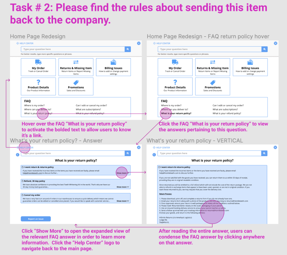
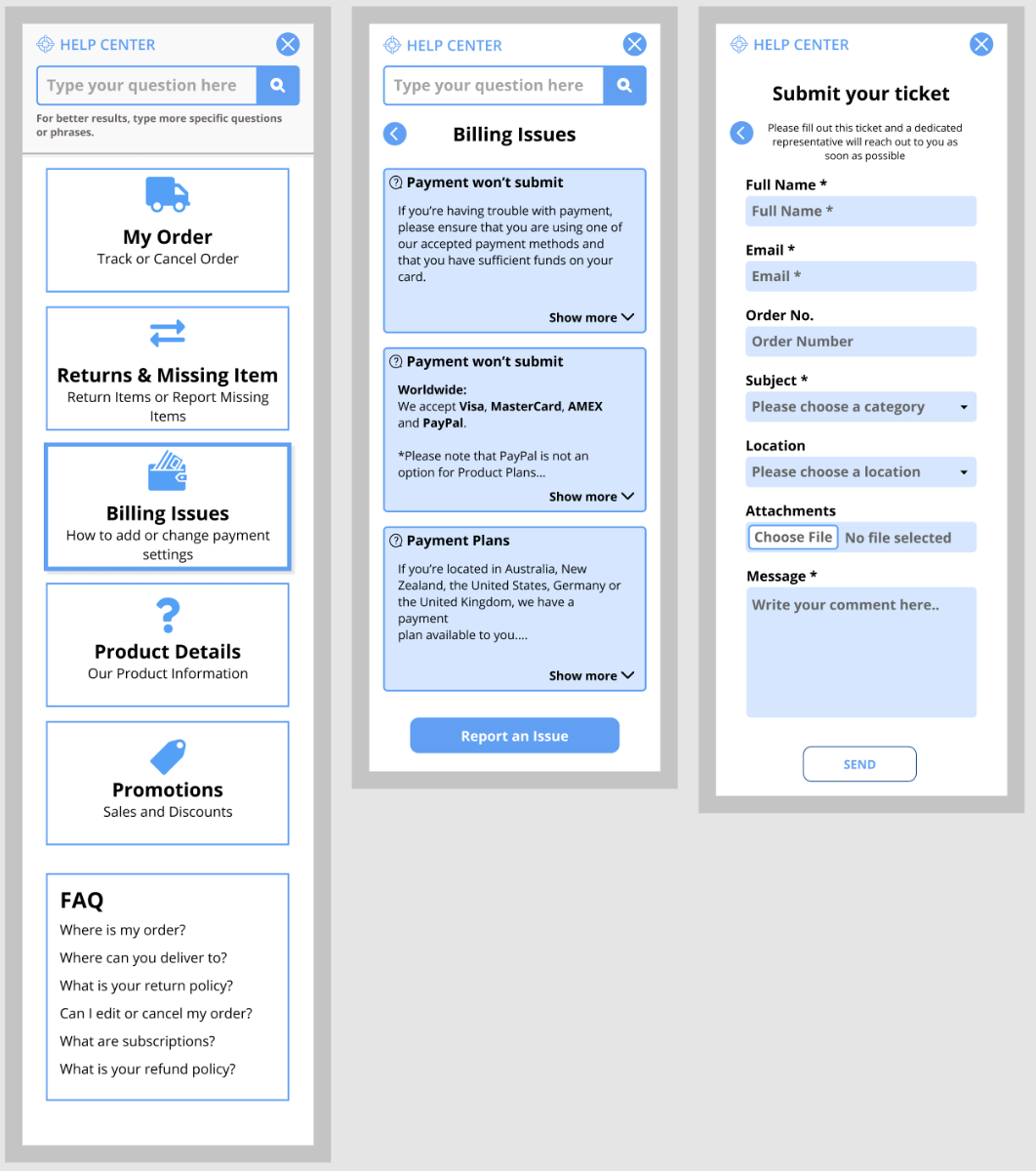
Based on the ideas generated in design studio, our team designed the above screen concepts, visualized as the six tasks presented in our mid-fidelity concept usability testing. The arrows show the “happy path” a user would take to complete the tasks directly (i.e., without any deviation).
Usability Testing Results
Round 1 (Existing/Current Design):

Task #1 was the easiest for users to complete as it was very straightforward/familiar while Task #3 was the most difficult. Task #2 was also fairly straightforward, but some users were confused by labeling and/or category names. Task #3 had failures as two users couldn’t locate the submission form as its button was counterintuitively labeled as “Not what you are looking for?”
Key Takeaways
Users found the existing design to be clean & simple to use
Design aesthetic was professional
Some users felt that the “Help Center” text size should be increased
Users found some subcategories unclear
Category names did not adequately describe its contents (e.g., “product information) and confused users
Target users found the existing “Help Center” useful
Users thought button hierarchy existed because of varying sizes
Many users did not expect to find a submission form when they clicked on the button labeled “Not what you are looking for?” as their last resort
Category/button icons were fun and inviting
Next Design Iteration: Enlarge text size by 20%, recategorize and/or relabel items to increase findability & clarity (e.g., rename “Product Information” to “Product Details,” add “Returns, Refunds, & Missing Items” action button to homepage, reorganize “Track Order” and “Cancel Order” options to be under the category “My Order”), make action buttons consistent in size, rename the “Not what you are looking for?” button to “Contact Customer Service.”
Round 2 (Mid-Fi Redesign):

Since there is an overlap of Tasks #1–3 from round 1, we’ve created deltas of the changes. Again, users had trouble with Task #3 and couldn’t efficiently find the form. However, the success rate did increase by 7% and users rated this task easier. There were negative deltas for Tasks #1–3, which we suspect is due to the B&W nature of the mid-fi design as most users kept losing focus compared to the previous round where color was present. Fortunately, newly added Tasks #4-6 had an overwhelming amount of direct successes.
Key Takeaways
Users still couldn’t locate the form
Homepage scrolling is suboptimal (for the FAQ’s)
Users didn’t like the unbalanced category icon box design
Confusion existed for “Track an Order” vs. “Status Order”
Automatic one-click feedback request pop-up was liked
Users didn’t like that “refund” was the only choice for “missing items”
Some confusion relating to the “Returns” action button and the FAQ “return policy”
Next Design Iteration: Rename the “Contact Customer Service” button to “Report an Issue,” reorganize the homepage layout so that FAQ’s can be viewed without scrolling, eliminate orphan action buttons, combine “Status Order” option into “Track an Order,” rename primary action button to “Returns & Missing Items” to exclude “Refunds” as a main process, create comment bubbles for the feedback request pop-up, add “resend” resolution option for “missing items.”
Round 3 (Hi-Fi Redesign):

The six tasks were pretty successful, they all had positive deltas regarding easiness rating, average time on task, success rate, except for Task #4’s success rate. Also, there was one failure for Task #3 because users continued to have issues locating the submission form. However, our design changes did improve its success rate by 14%, users rated it easier to complete, and average completion time decreased.
Key Takeaways
Users liked the streamlined returns & missing items process
Choices of “resending” or “refunding” a missing item were appreciated
Action buttons towards the top and FAQ’s towards the bottom of the homepage worked
A few users confused the “Returns & Missing Items” action button with the FAQ link
Many users wouldn’t leave feedback for automated “Help Centers” unless they had an extremely negative or extremely positive experience
Users thought that the “Report an issue” button was for reporting “technical issues”
Users would leave quick feedback using the 5-star rating icons and comment bubbles
Next Design Iteration: Brainstorm new names for the form submission button, provide additional helpful notes to customers (e.g., “We’ll respond in 24 hours” on the form submission confirmation page), make “Next Steps” instructions more noticeable on the “returns” confirmation page, curate a more motivational tone for the feedback request pop-up window to encourage customers to leave feedback.
Product Concepts & Prototypes Iterated


Recommendations: Thoughts & Next Steps
The “tracking a package” feature would greatly benefit from existing API’s like USPS or UPS tracking services since they are major shipping services used by a wide array of industries - the choice of tracking service would be up to the company. Users can track their packages confidently and in real-time with USPS or UPS API’s so that our “Help Center” does what it needs without taking the time to build out a secondary tracking system that could be unreliable.
The most important post-launch metrics are: decreased number of customer tickets created compared to total number of customers using the “Help Center,” decreased number of phone calls to customer service, decreased average time spent in the “Help Center,” increased positive customer feedback & ratings, and increased number of completed returns & missing items using the “Help Center.” These metrics will measure the quality of the user experience so we can determine whether any features need upgrading.
Our team reviewed all our research, design, and testing results and boiled everything down to a high-level palatable list of next step suggestions: reiterate the “Help Center” design based on our last usability testing round 3 key takeaways/suggestions along with additional rounds of testing, track suggested KPI’s at relaunch, adhere to our best practices list when customizing the “Help Center” for new clients, and incorporate the necessary API’s.
With the aforementioned aspects executed, customers will have a more fine-tuned “Help Center” that they will gladly come back to for all their online order needs, whether for a process or information. In consequence, customers will not need to waste their time waiting to speak with a customer service.
Reflection: Lessons Learned

The minimalistic style of a product appears to better assists customers in finding what they need relating to online orders even though our initial assumption was that they’d want more animations, images, or colors to keep them engaged.
It is always important to keep the goals of the business as well as the customer in mind - there needs to be a delicate balance in the design to accommodate both parties.
Involving as many product stakeholders as possible in design studio is invaluable as it allows the entire team to be on the same page about the product direction and can unexpectedly better clarify features/services.